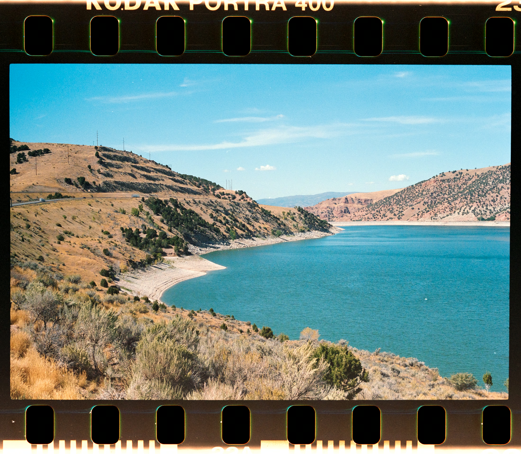
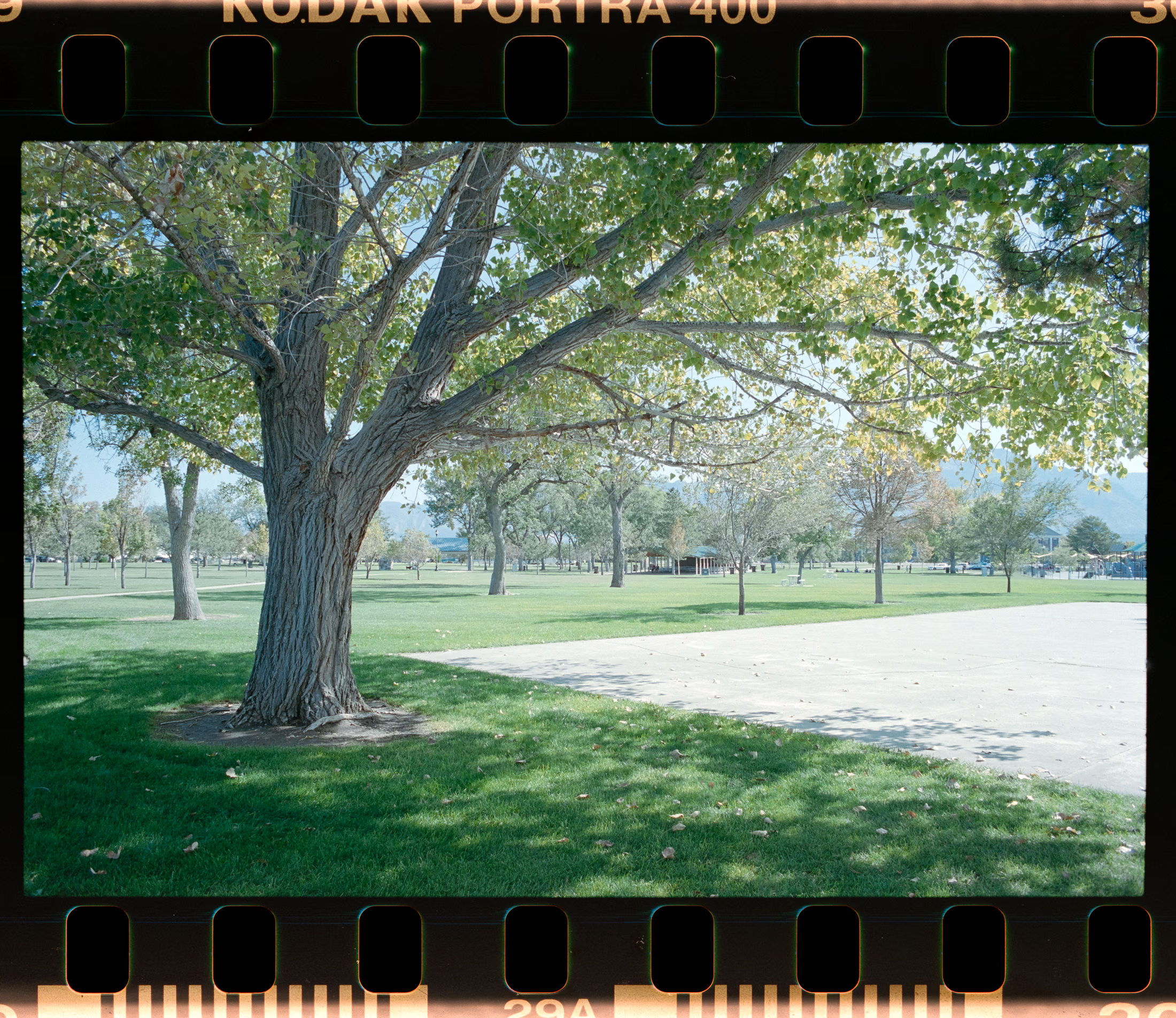
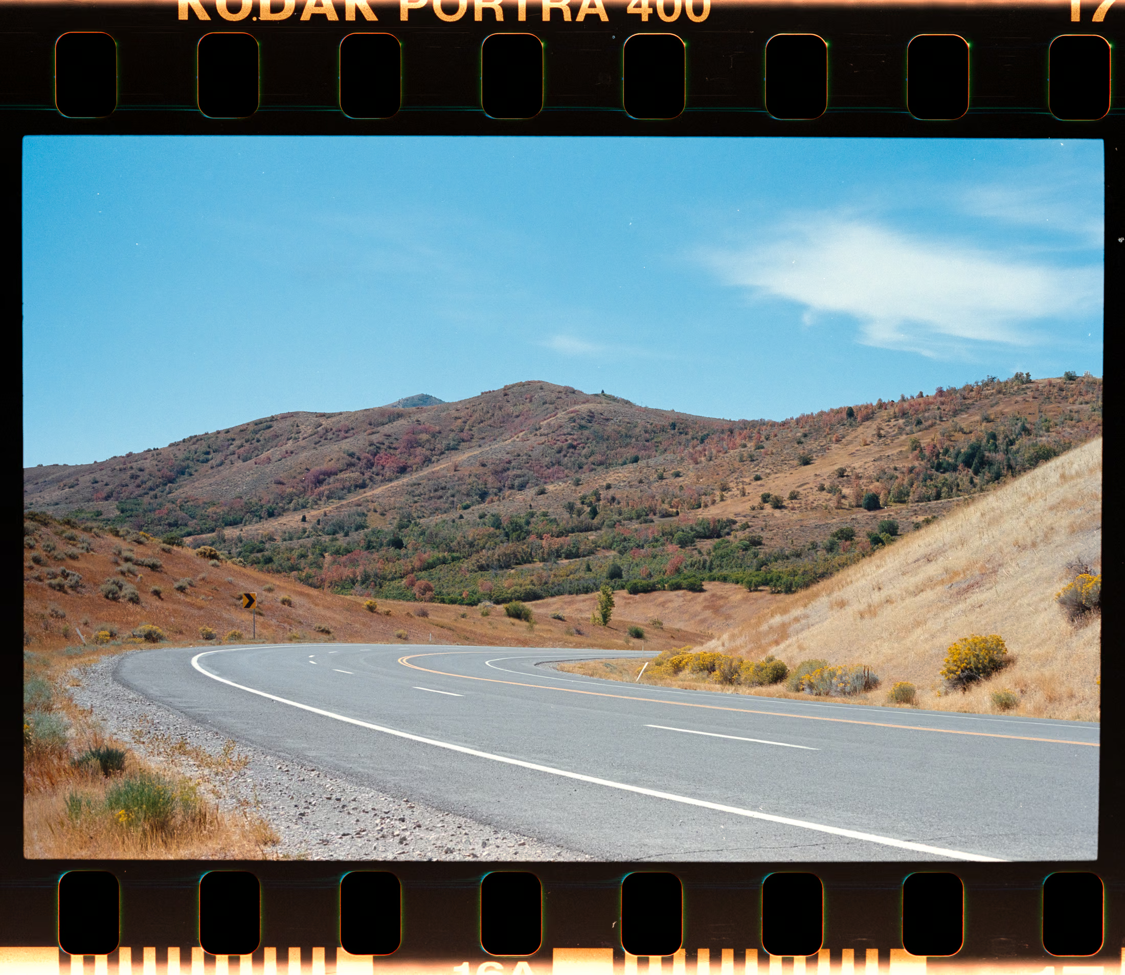
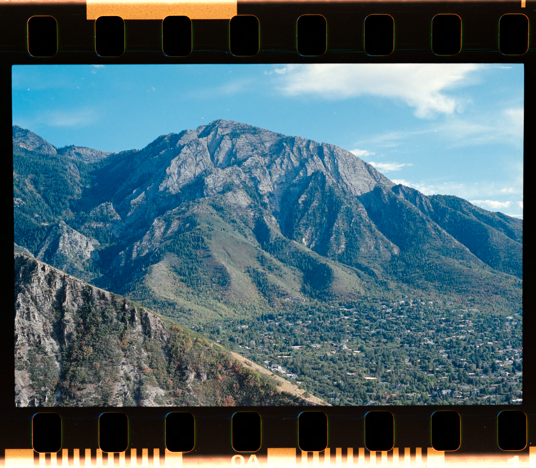
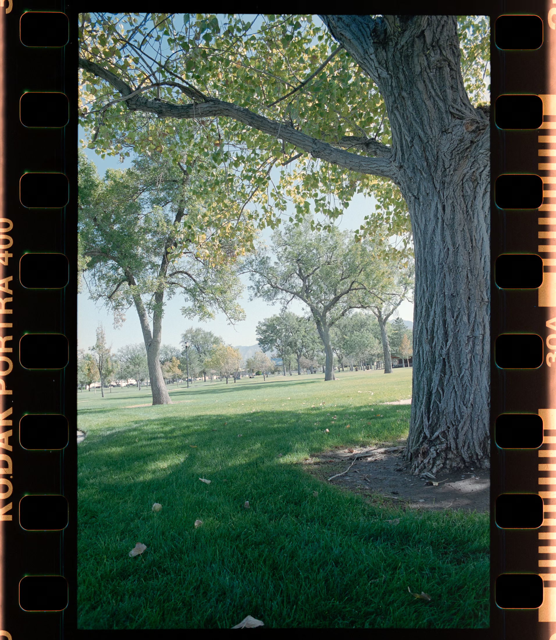
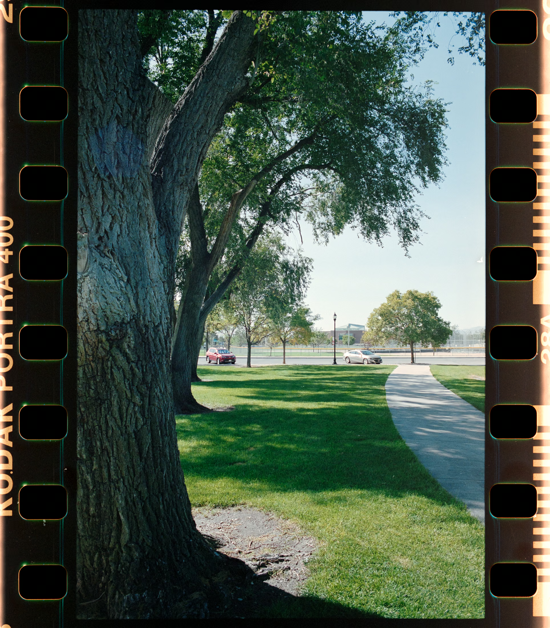
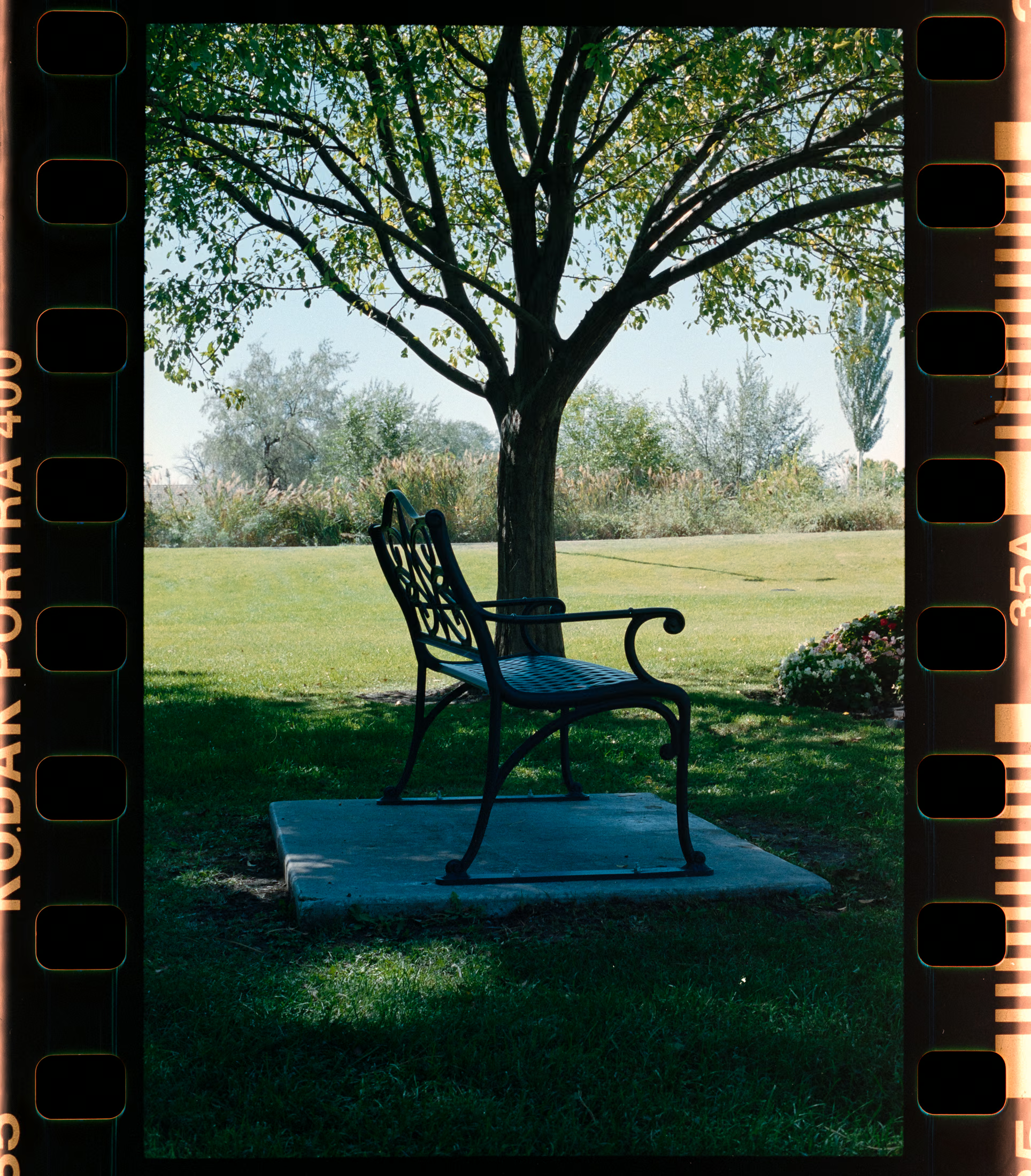
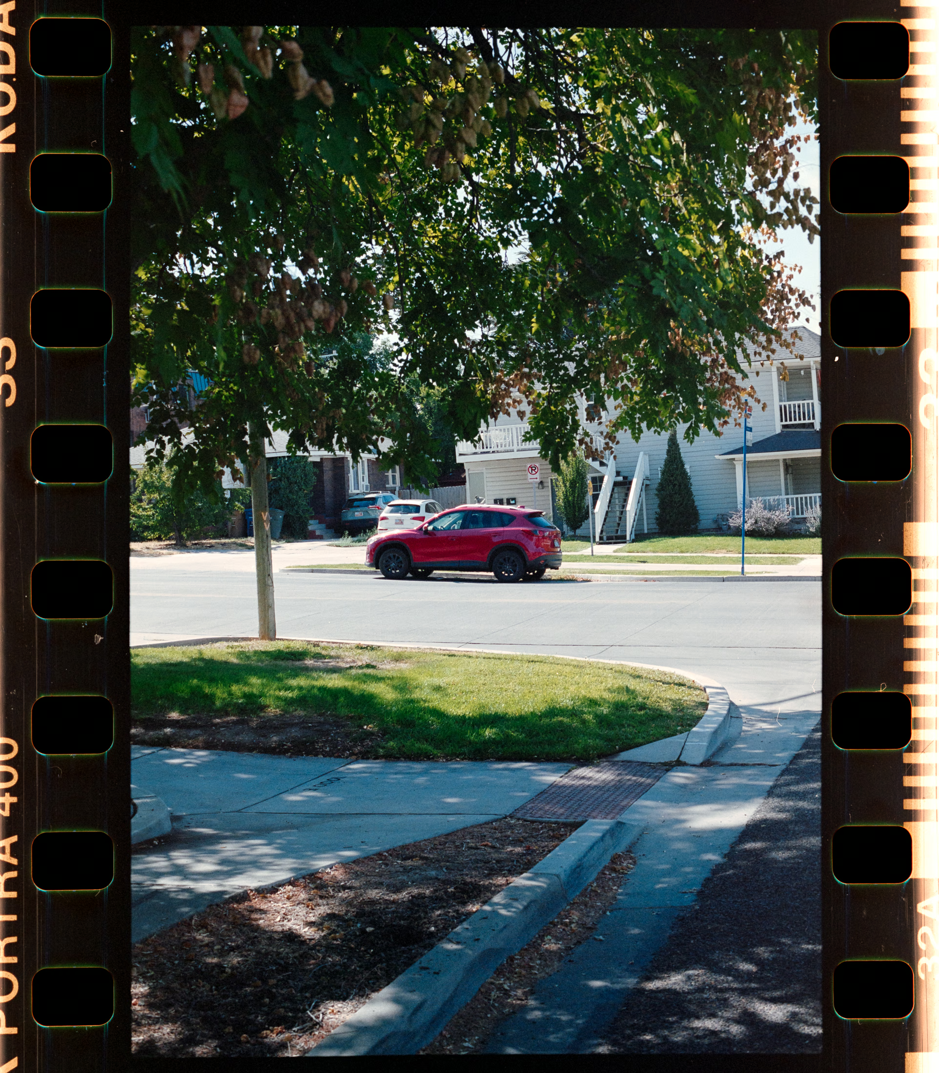
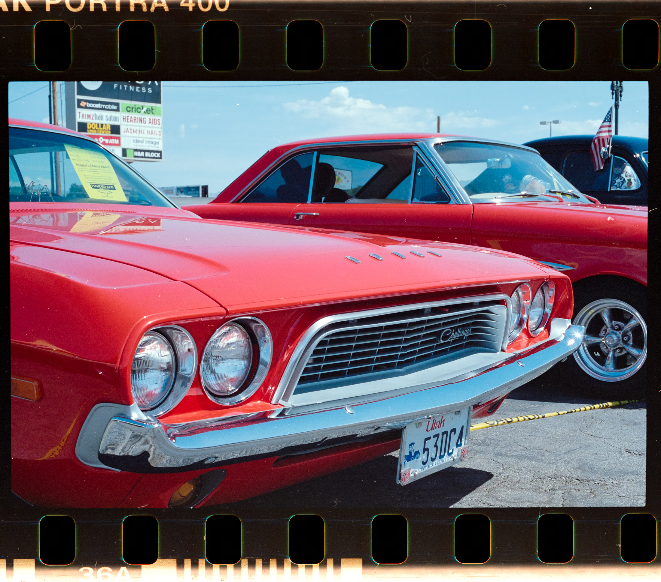
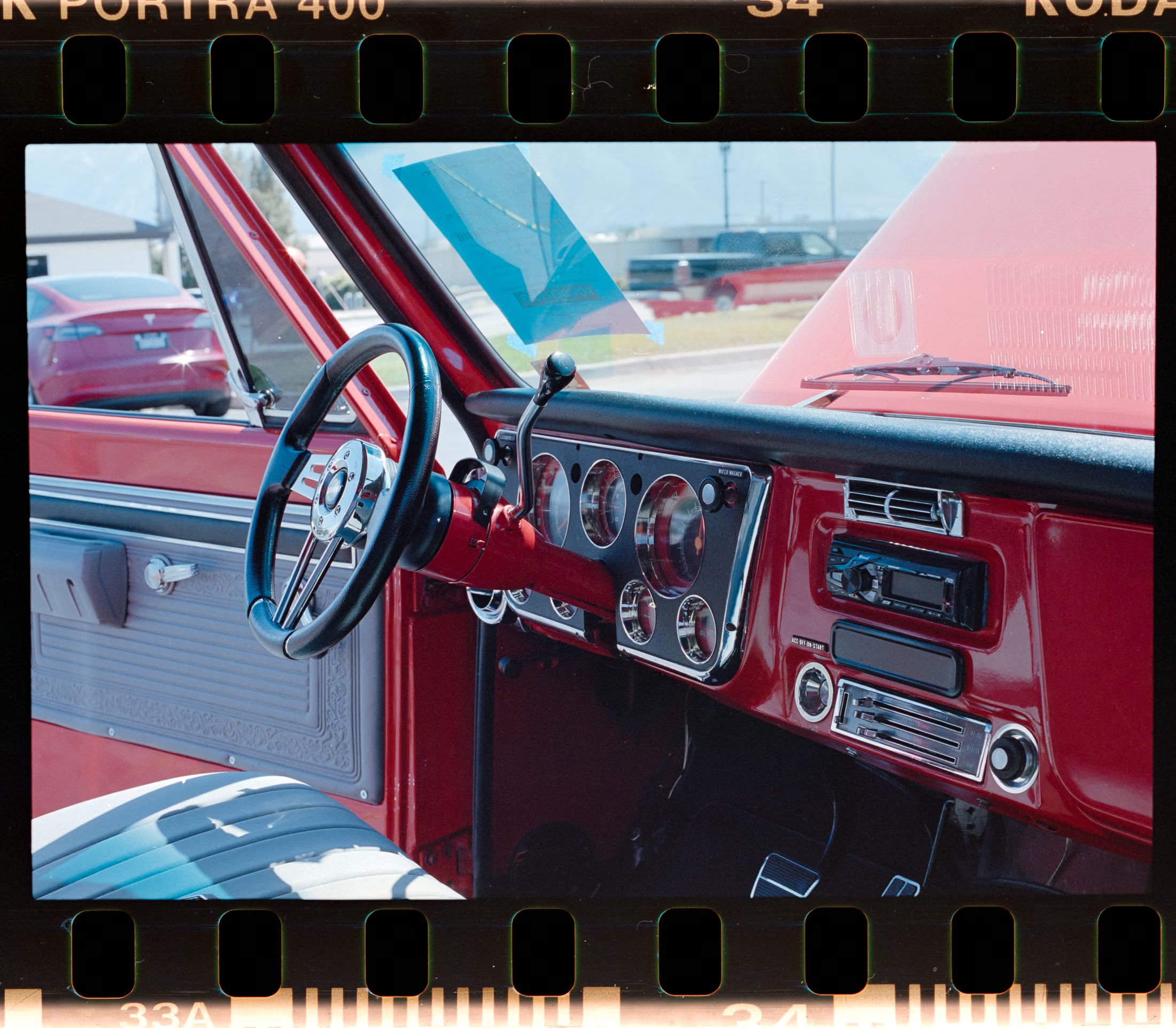
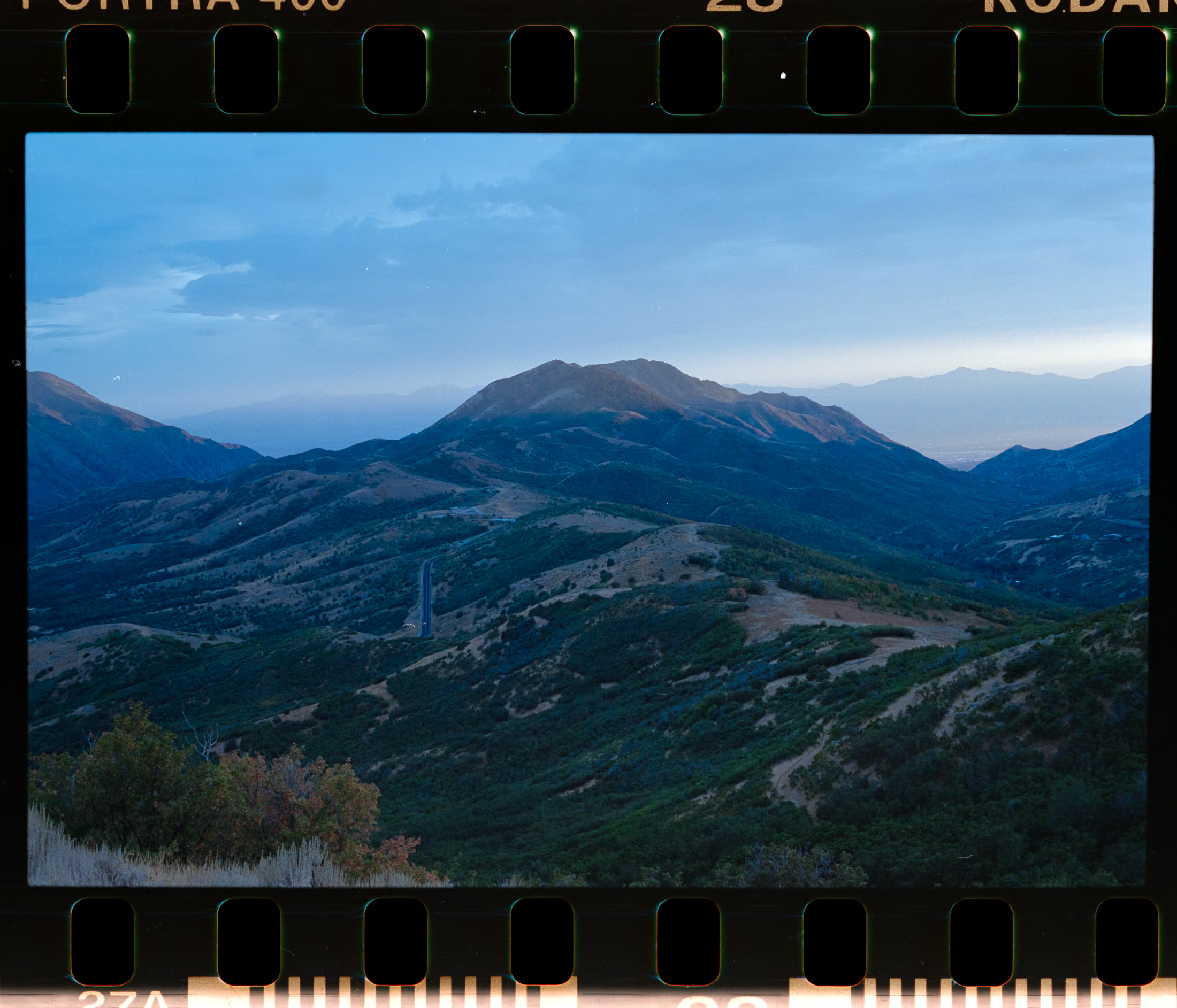
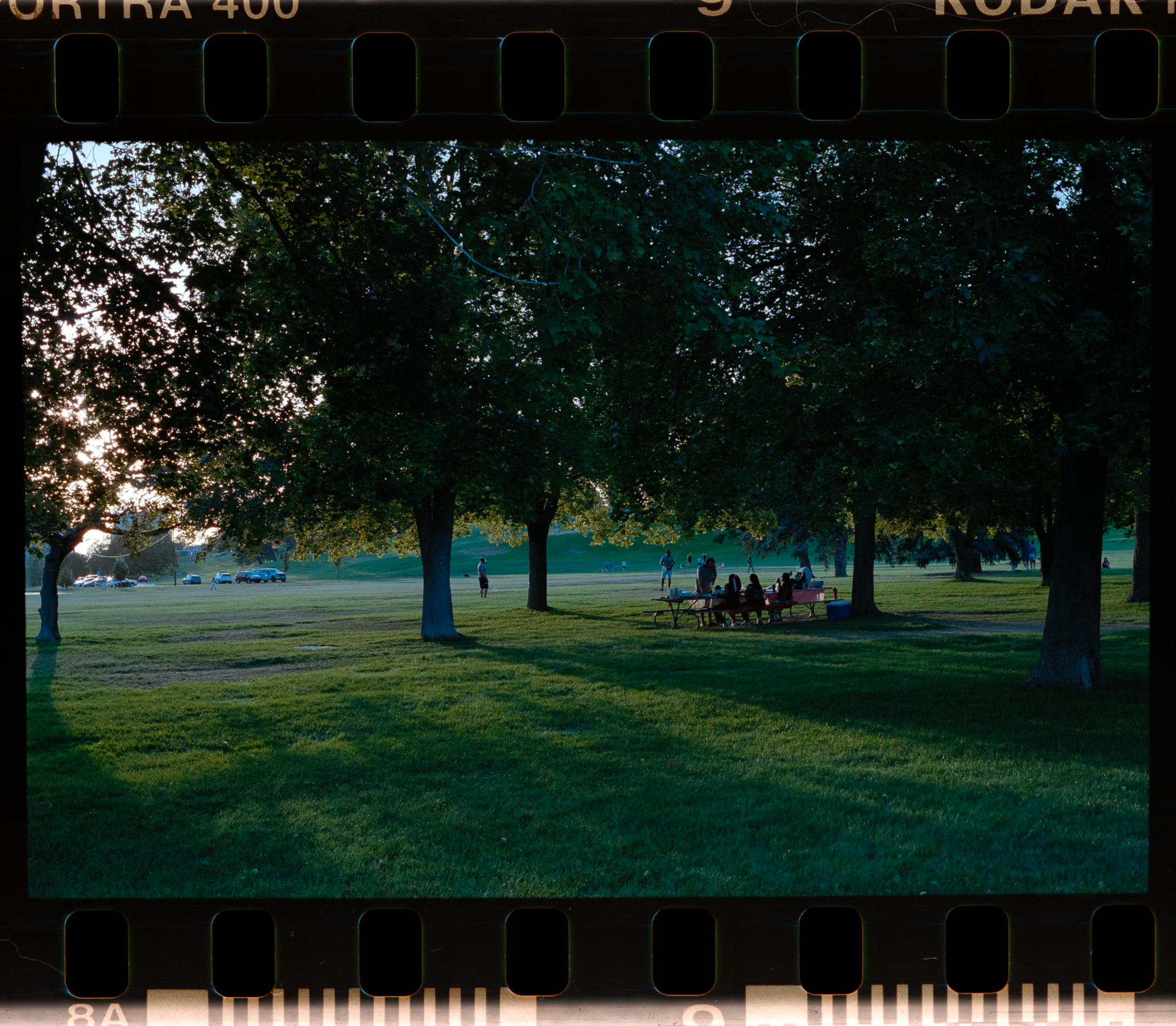
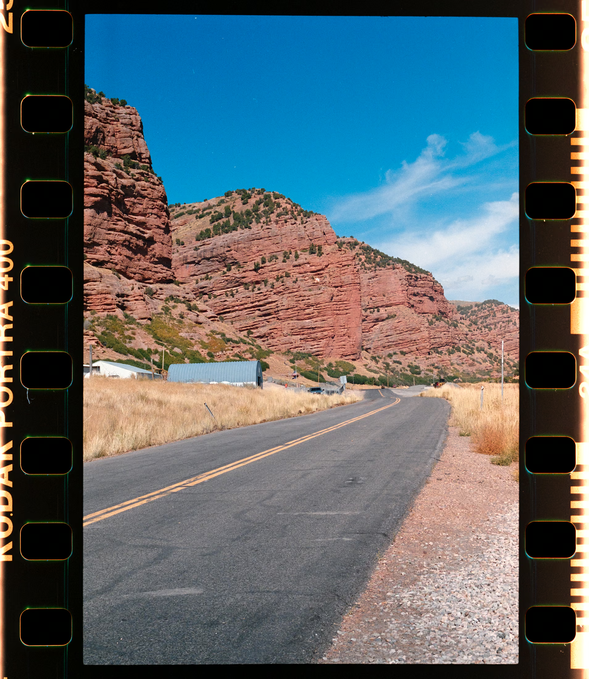
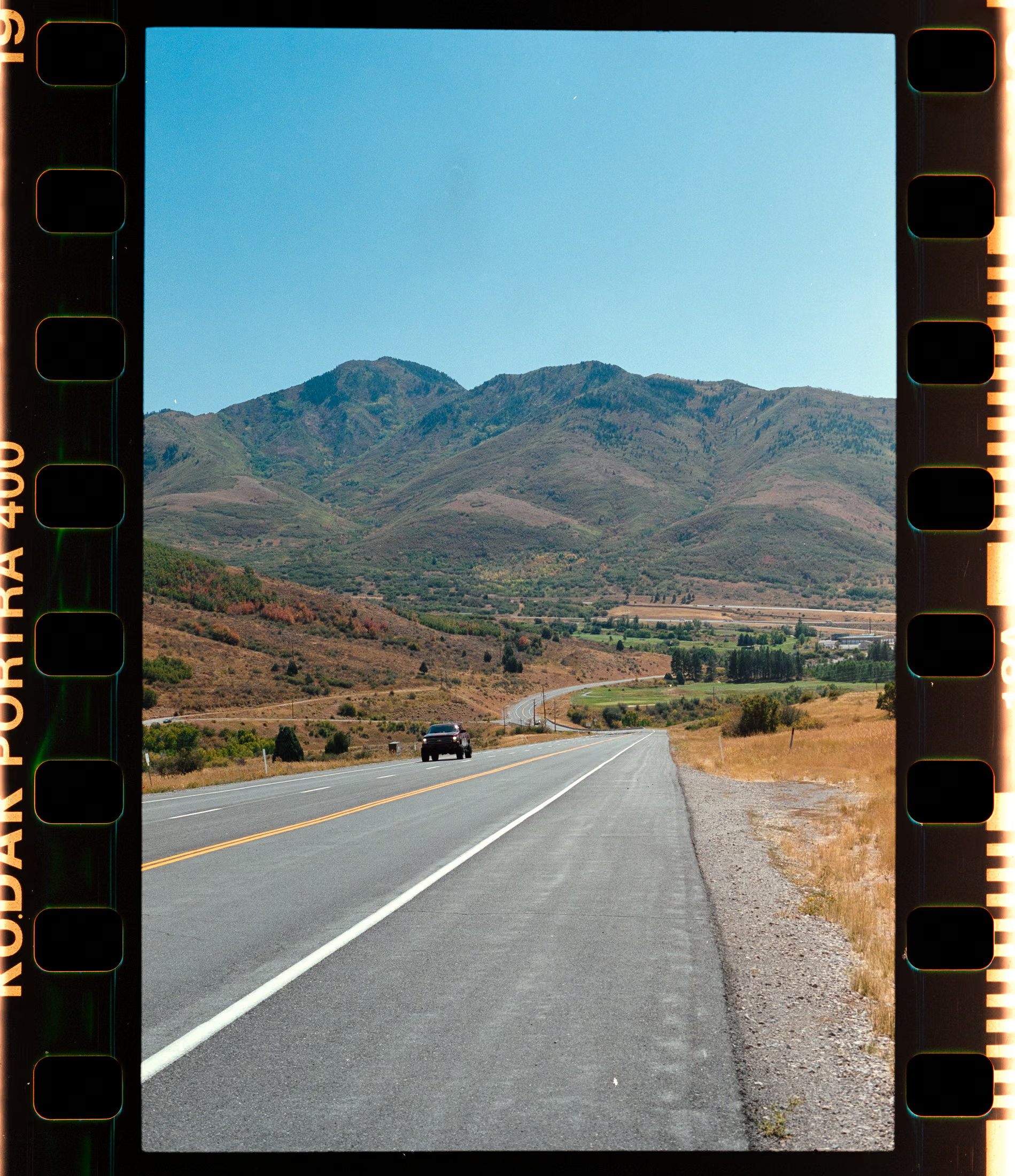
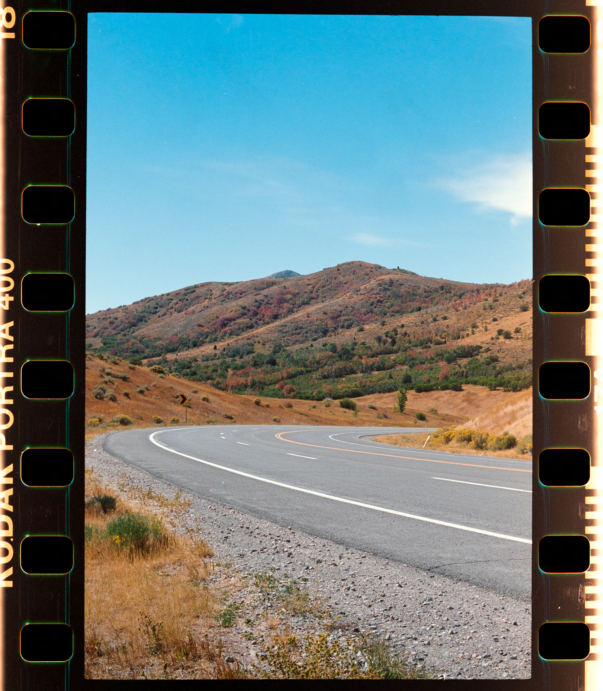
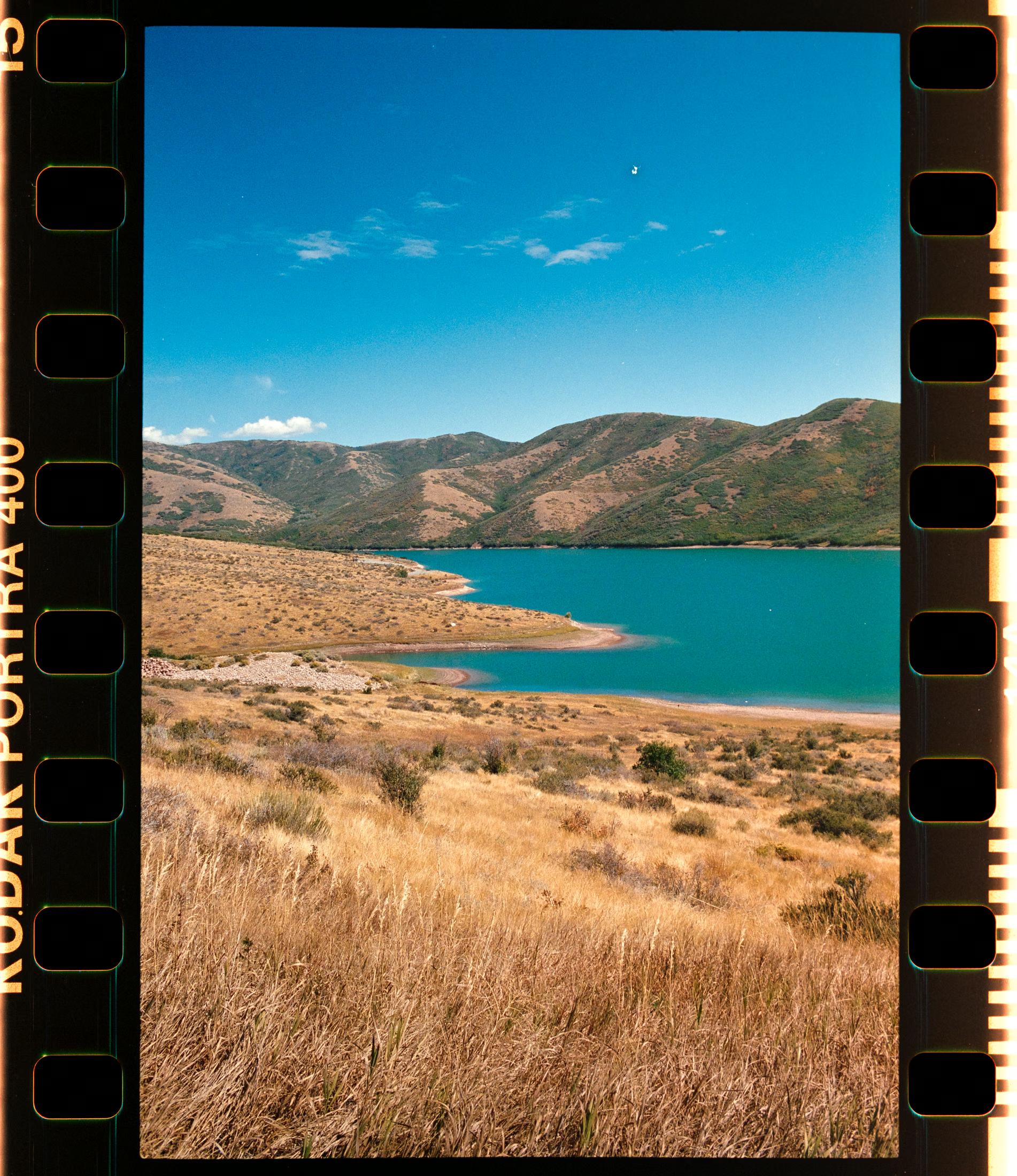
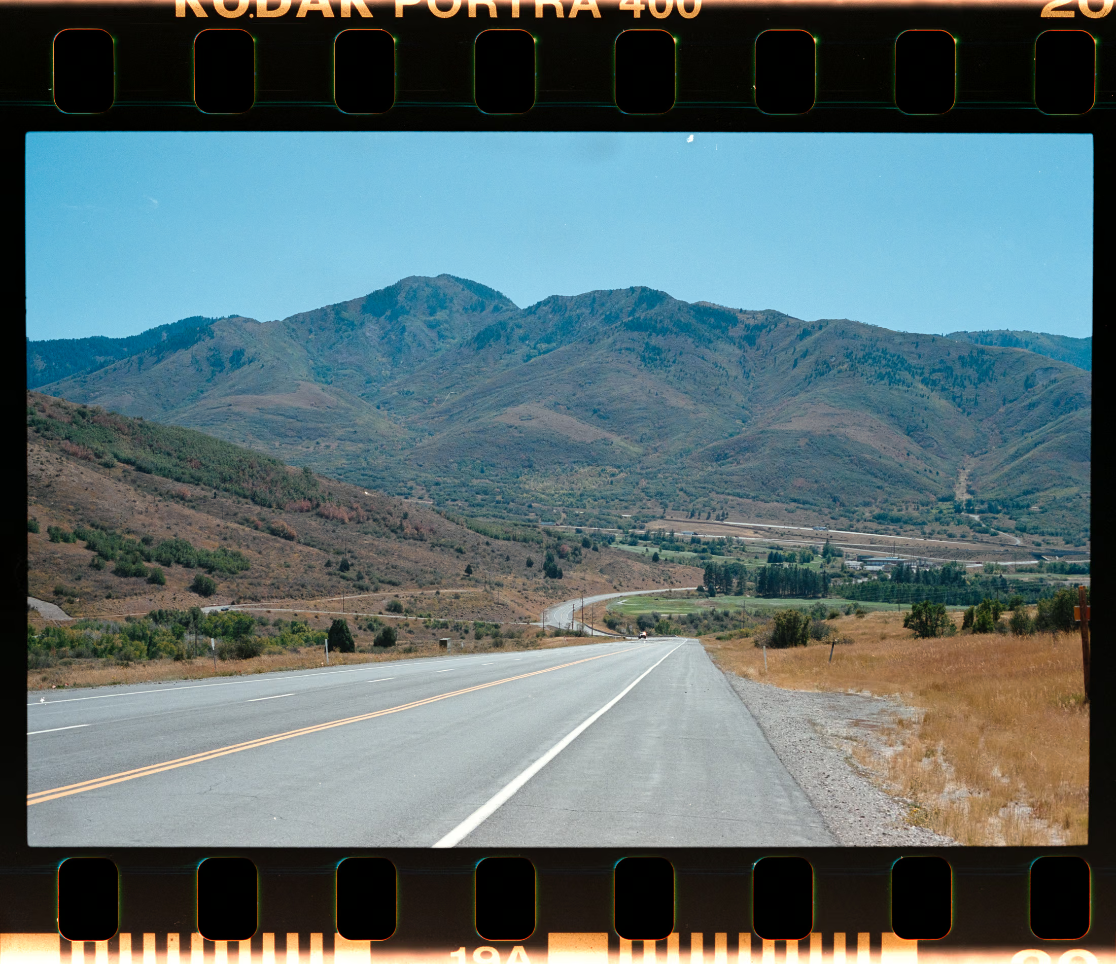
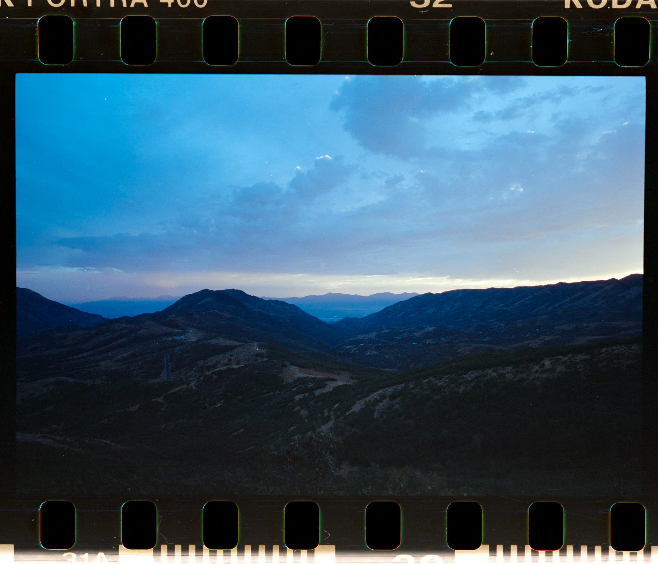
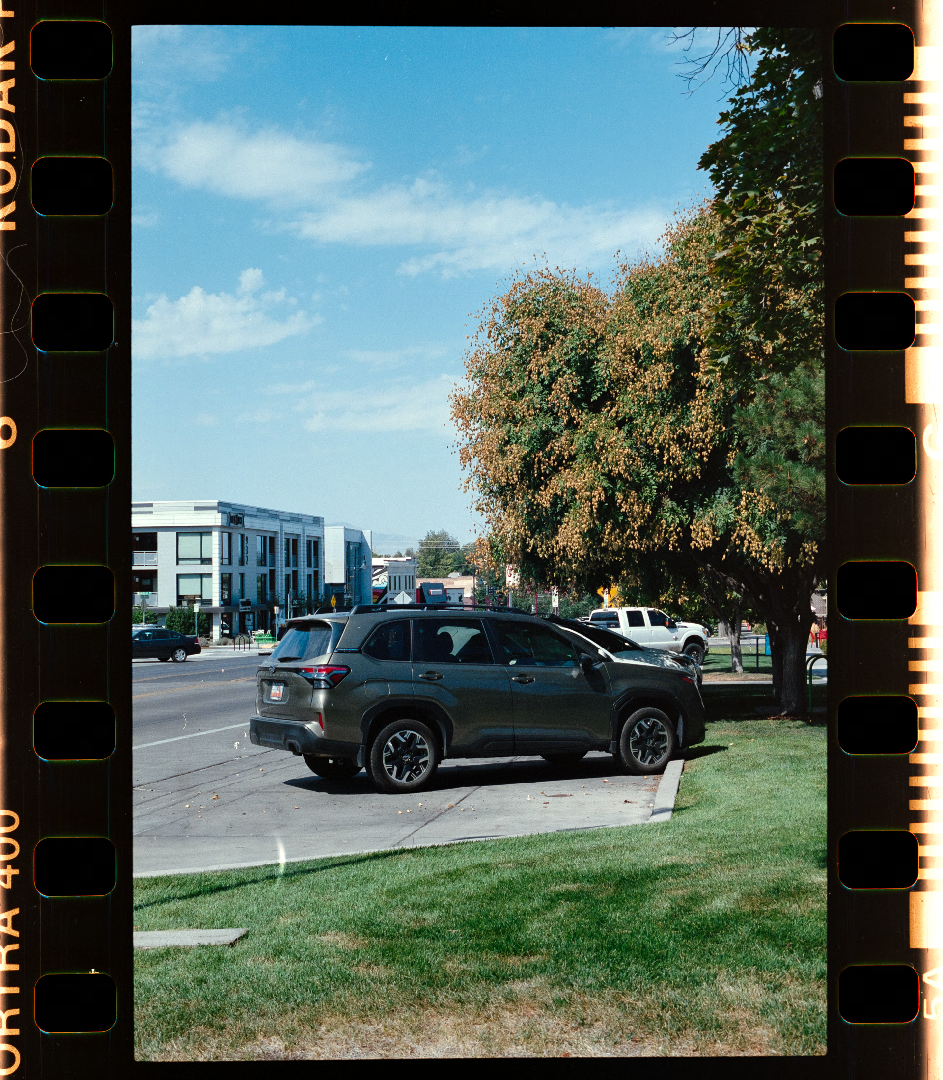
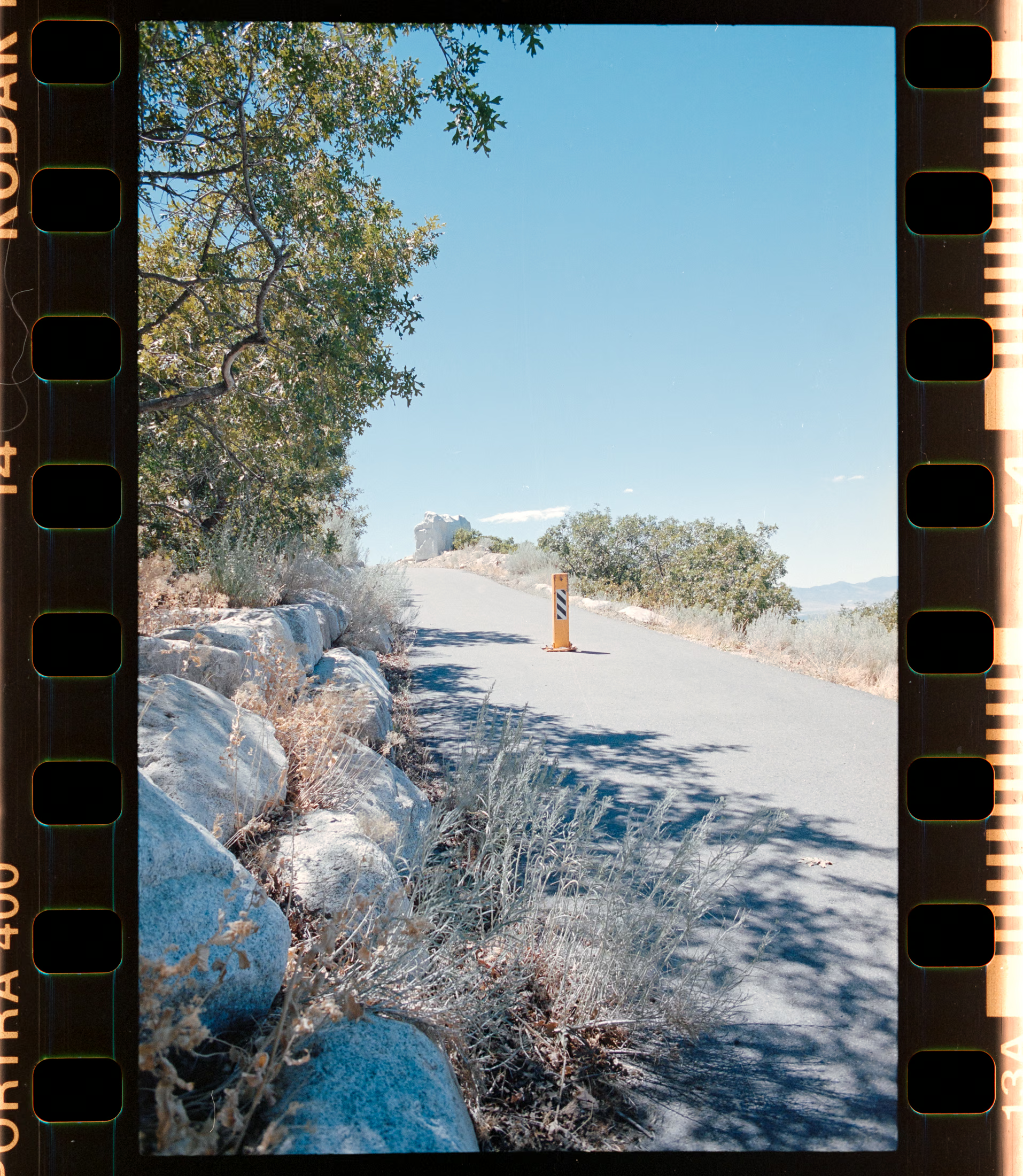
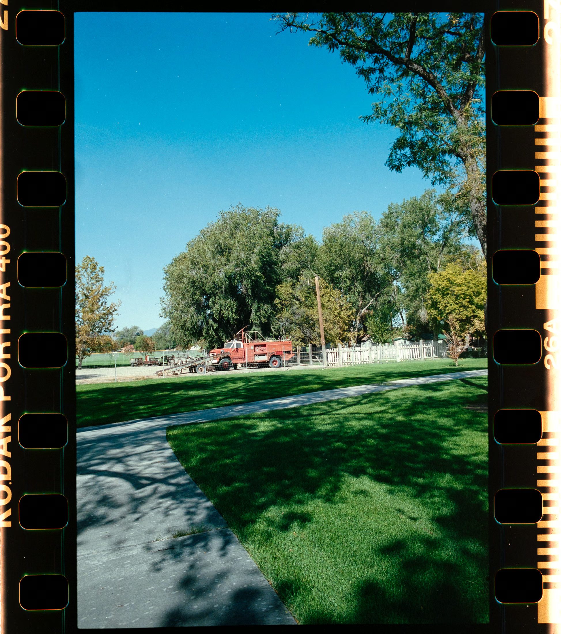
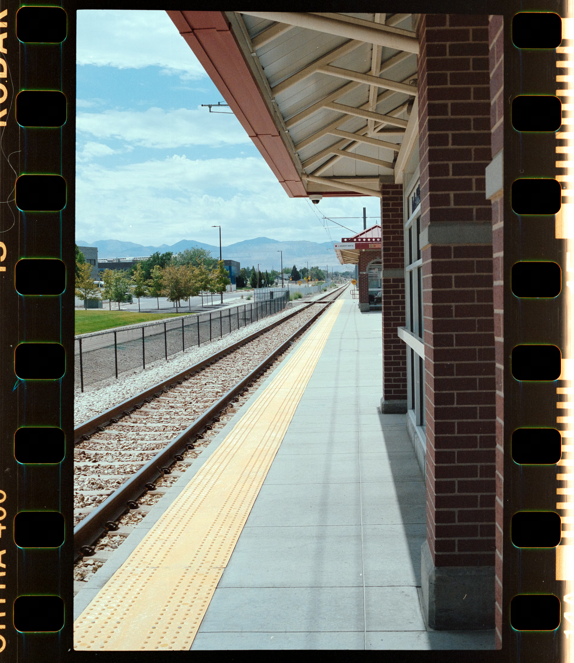
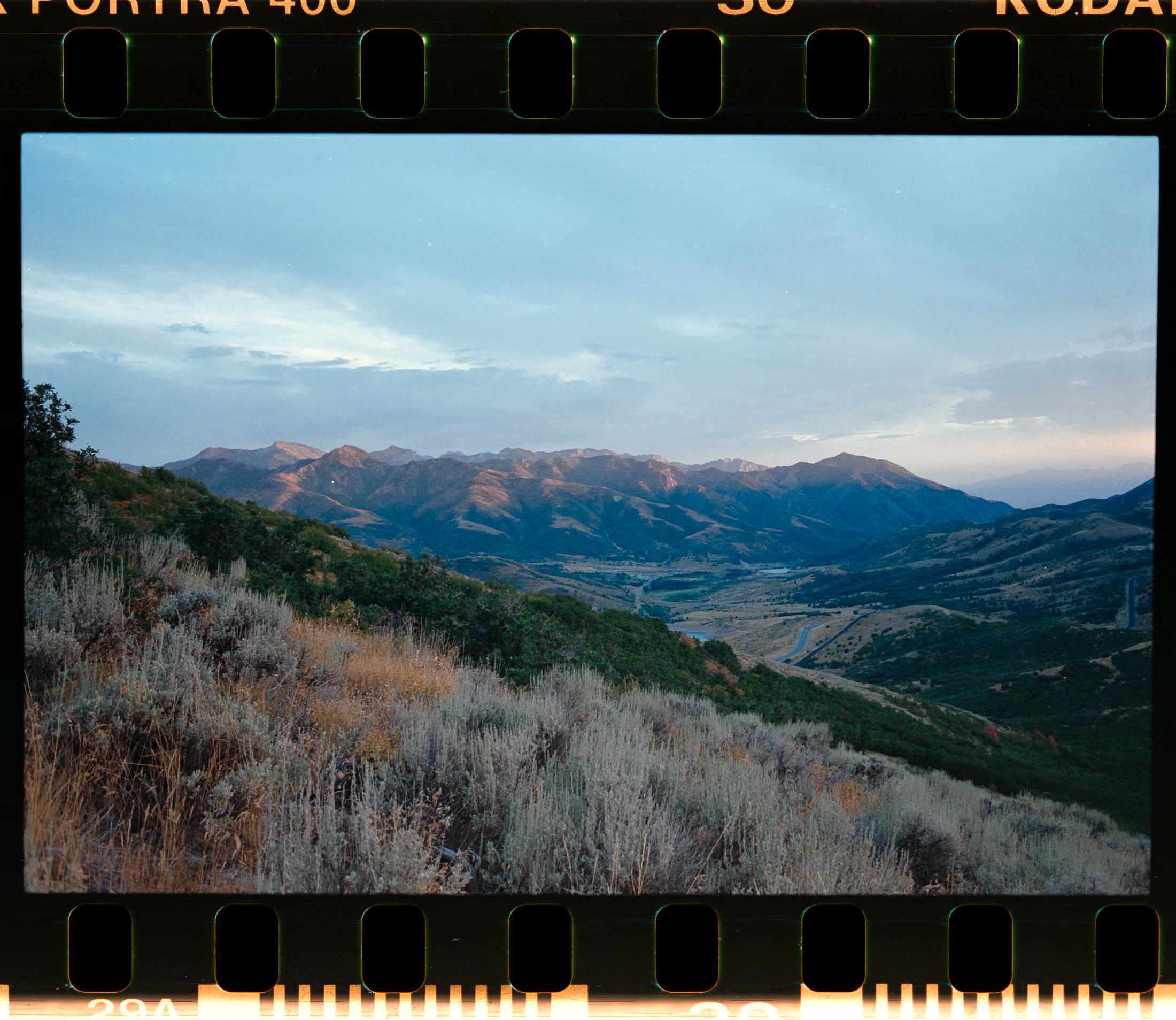
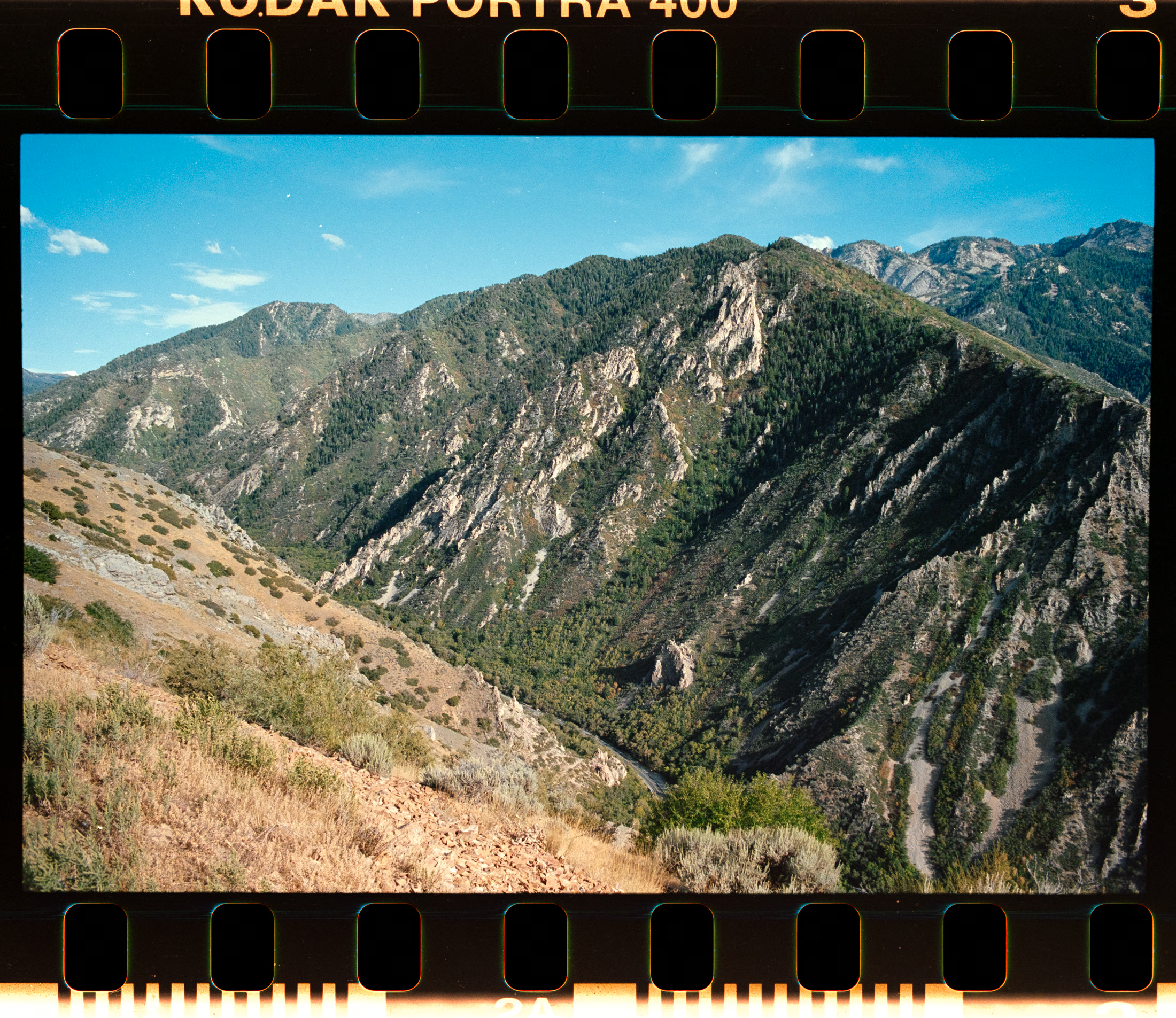
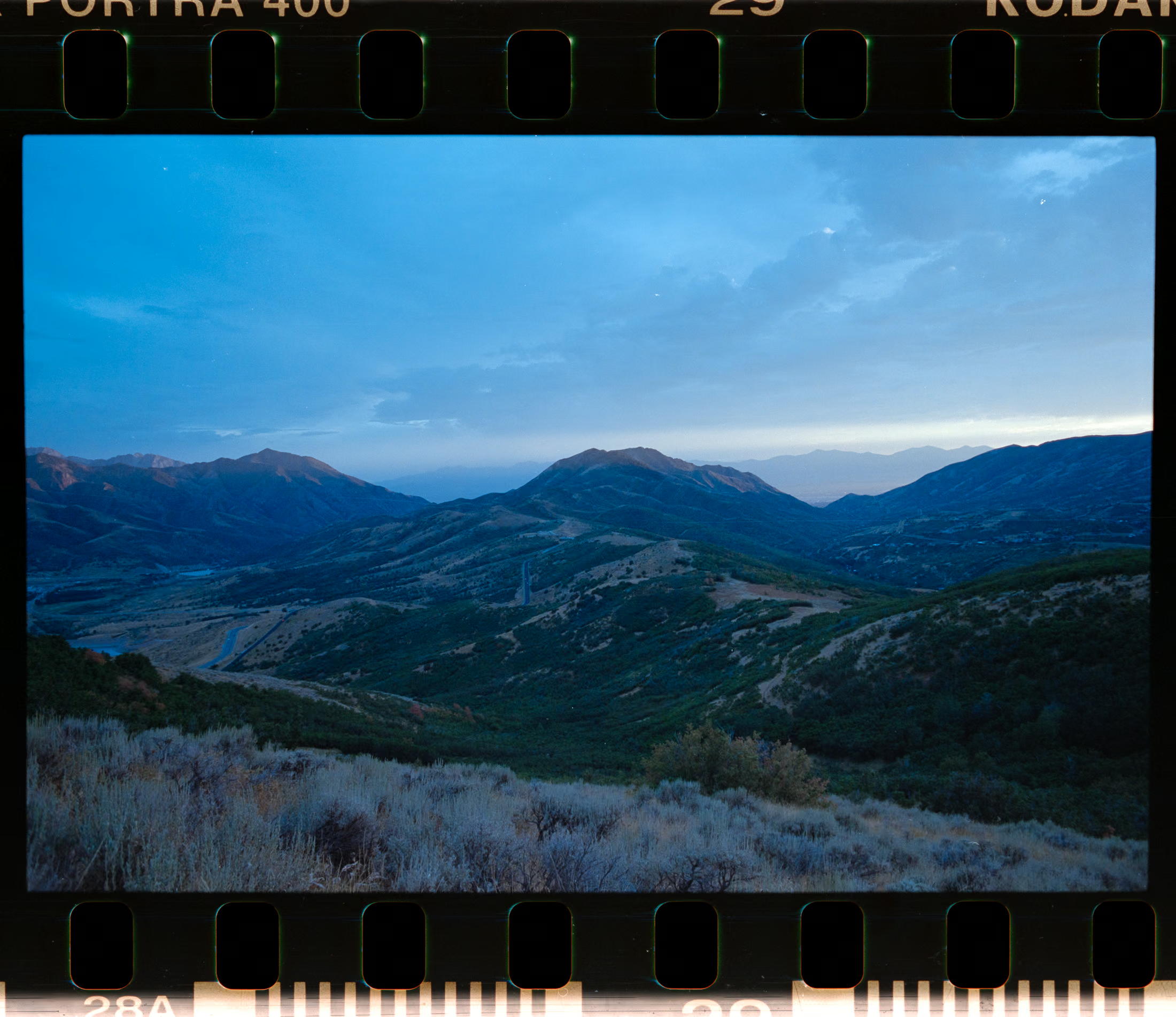
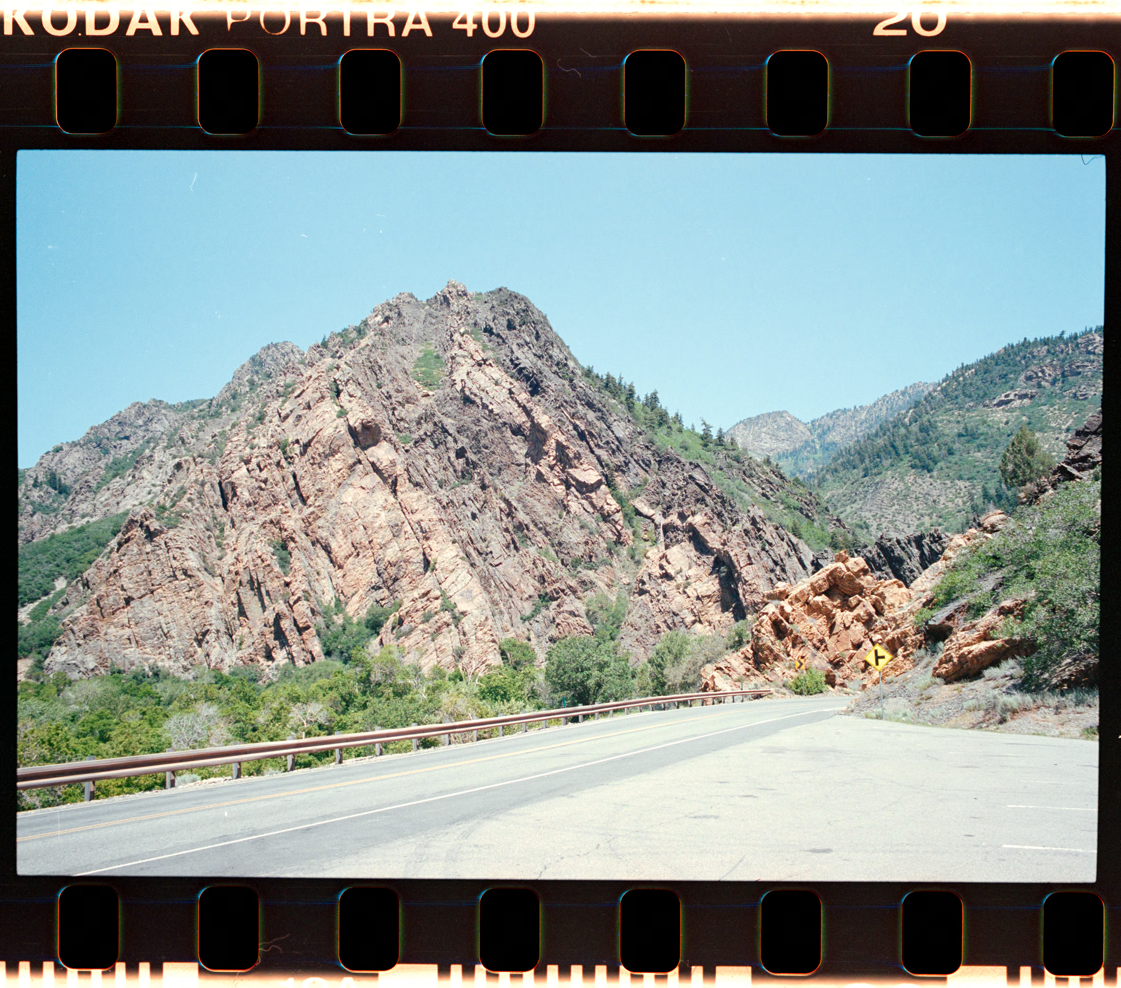
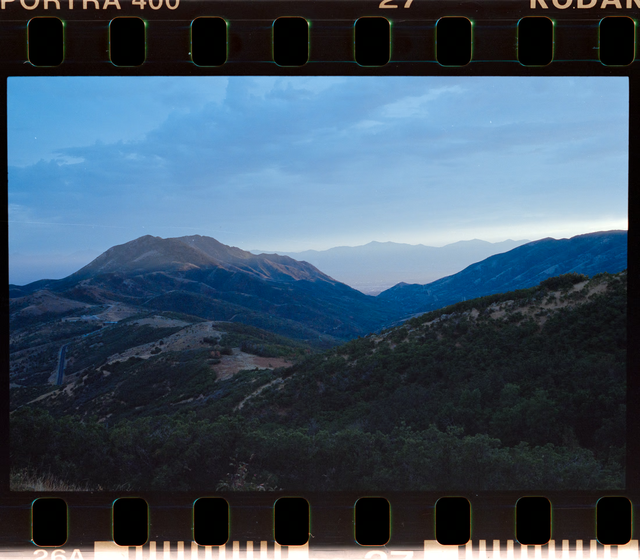
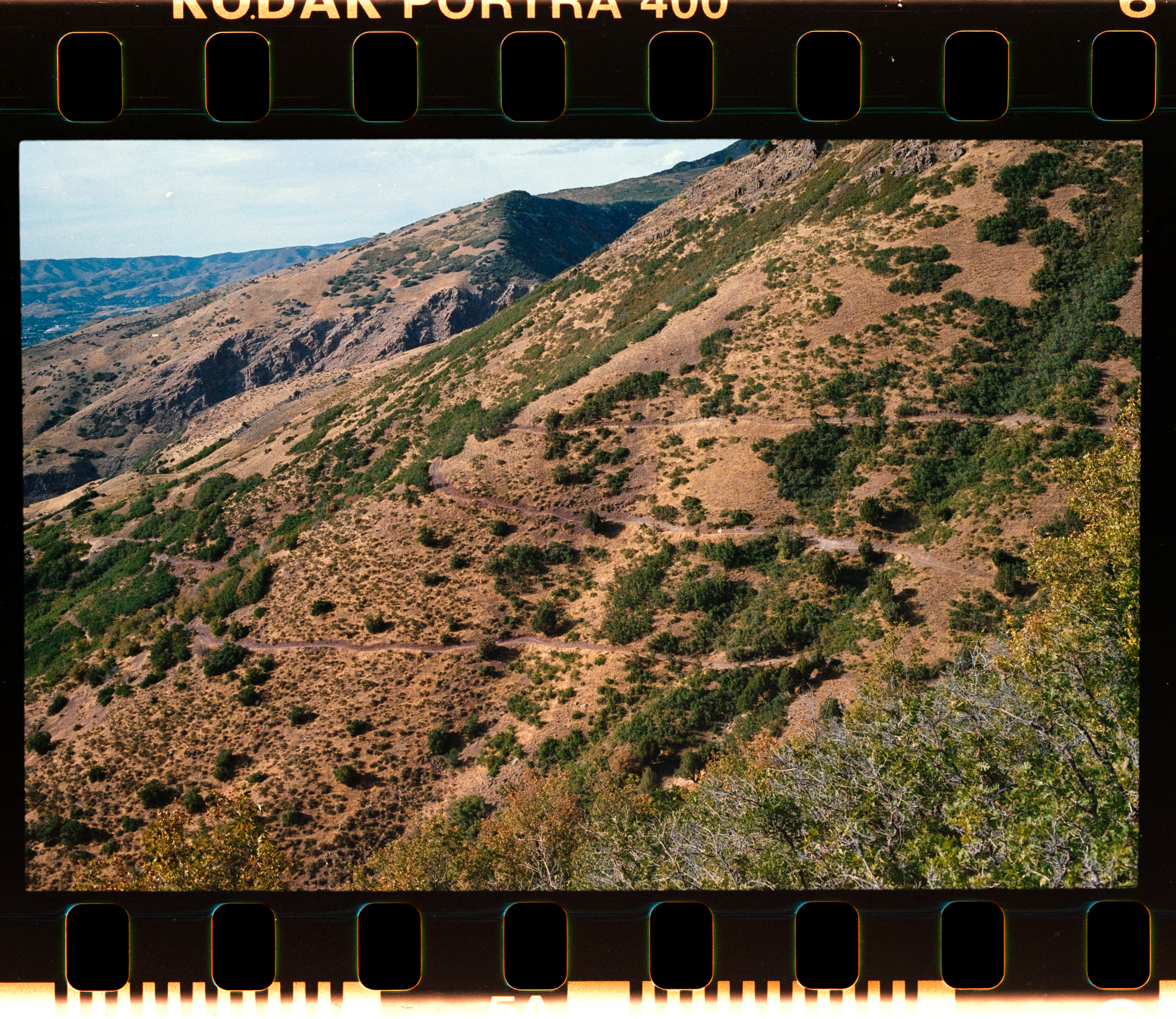
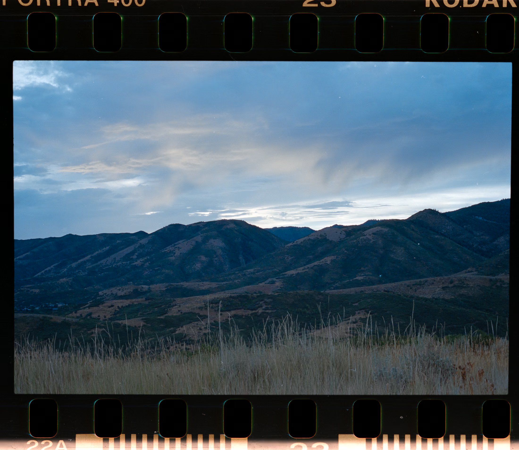
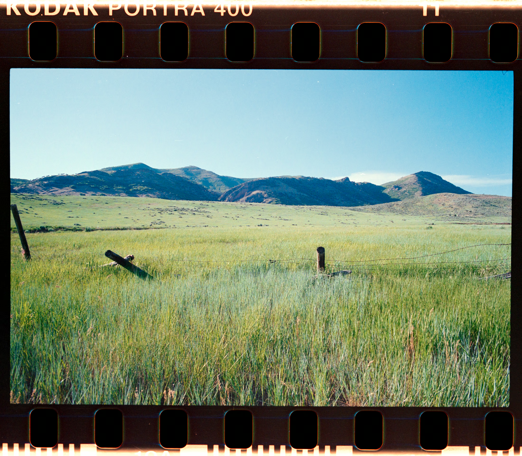
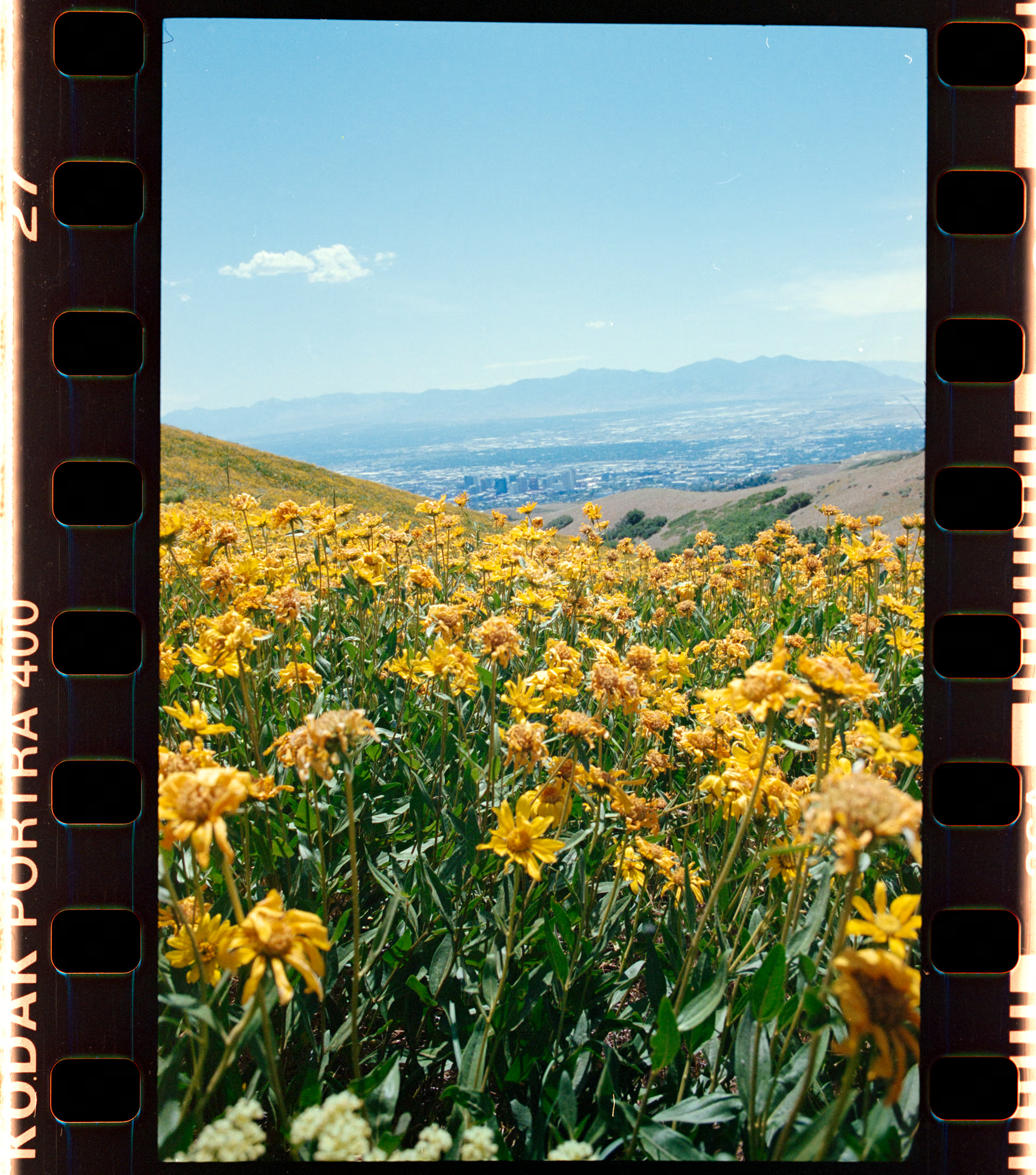
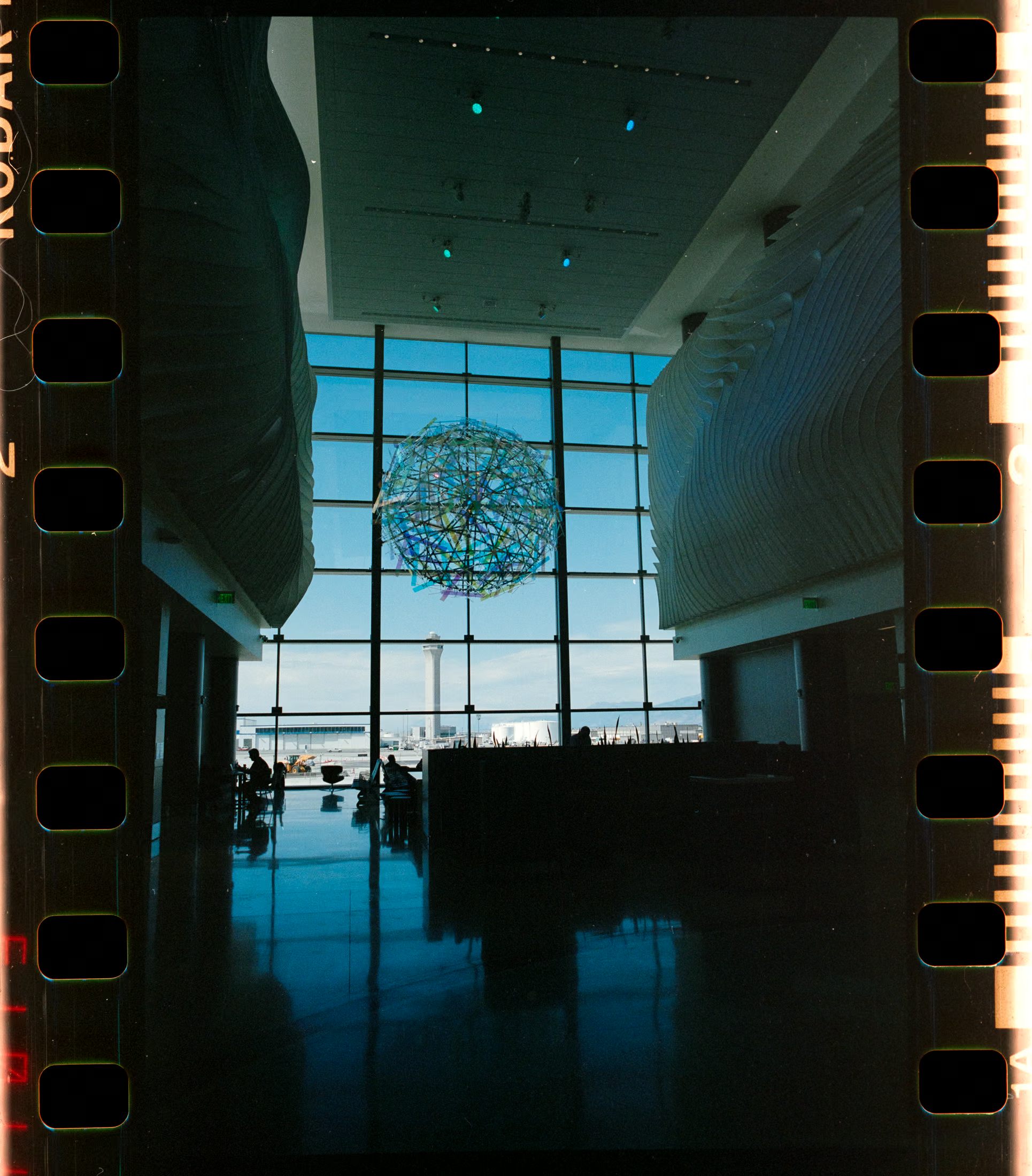
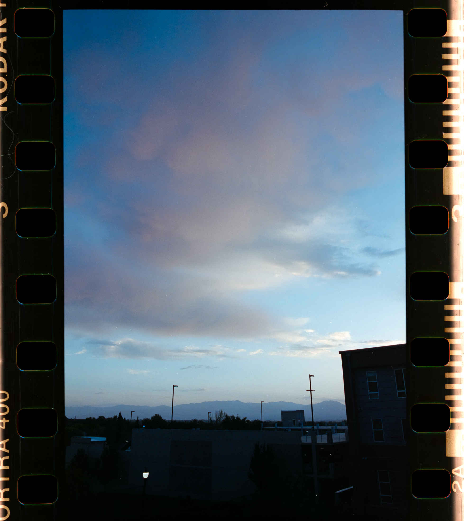
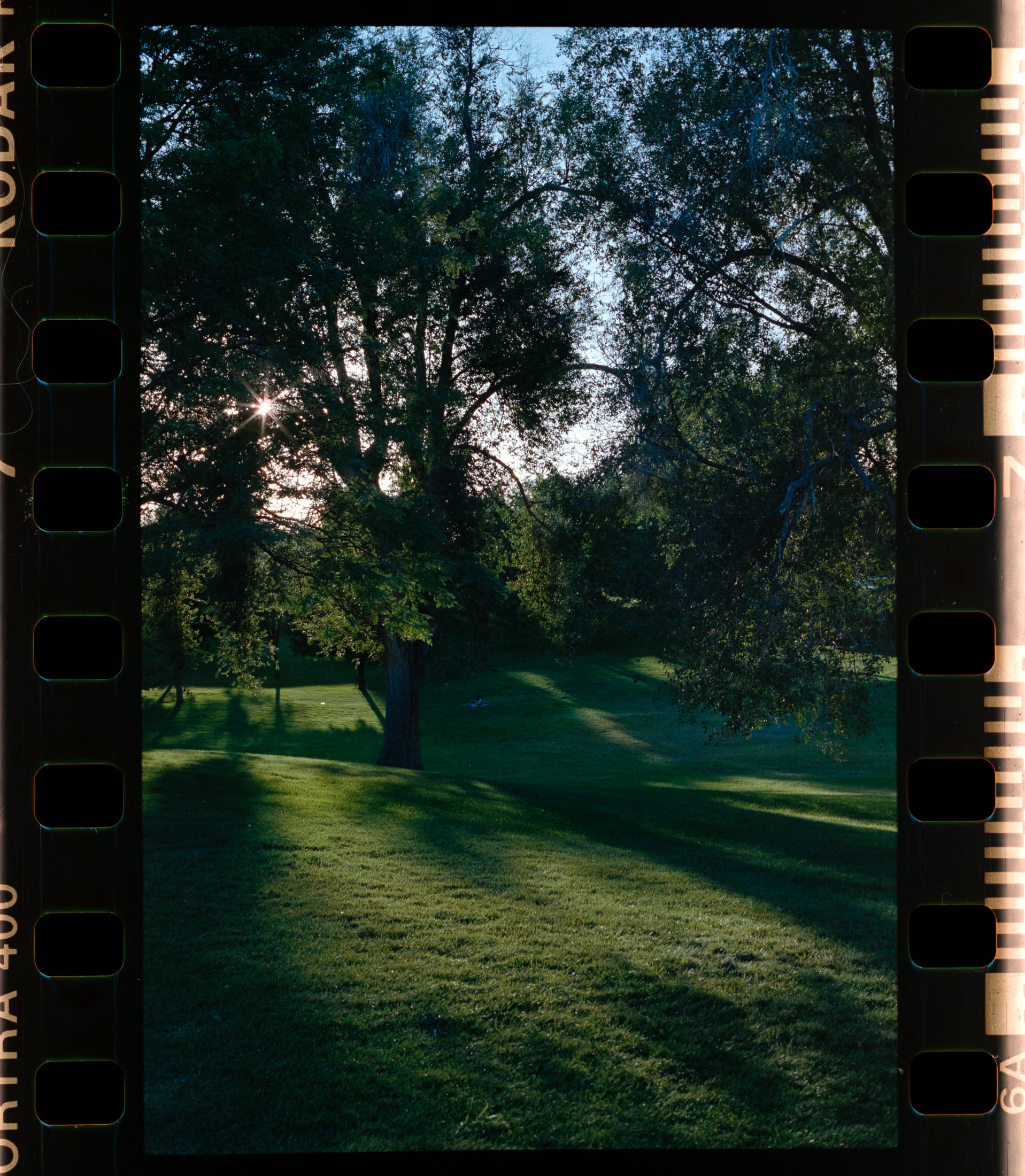
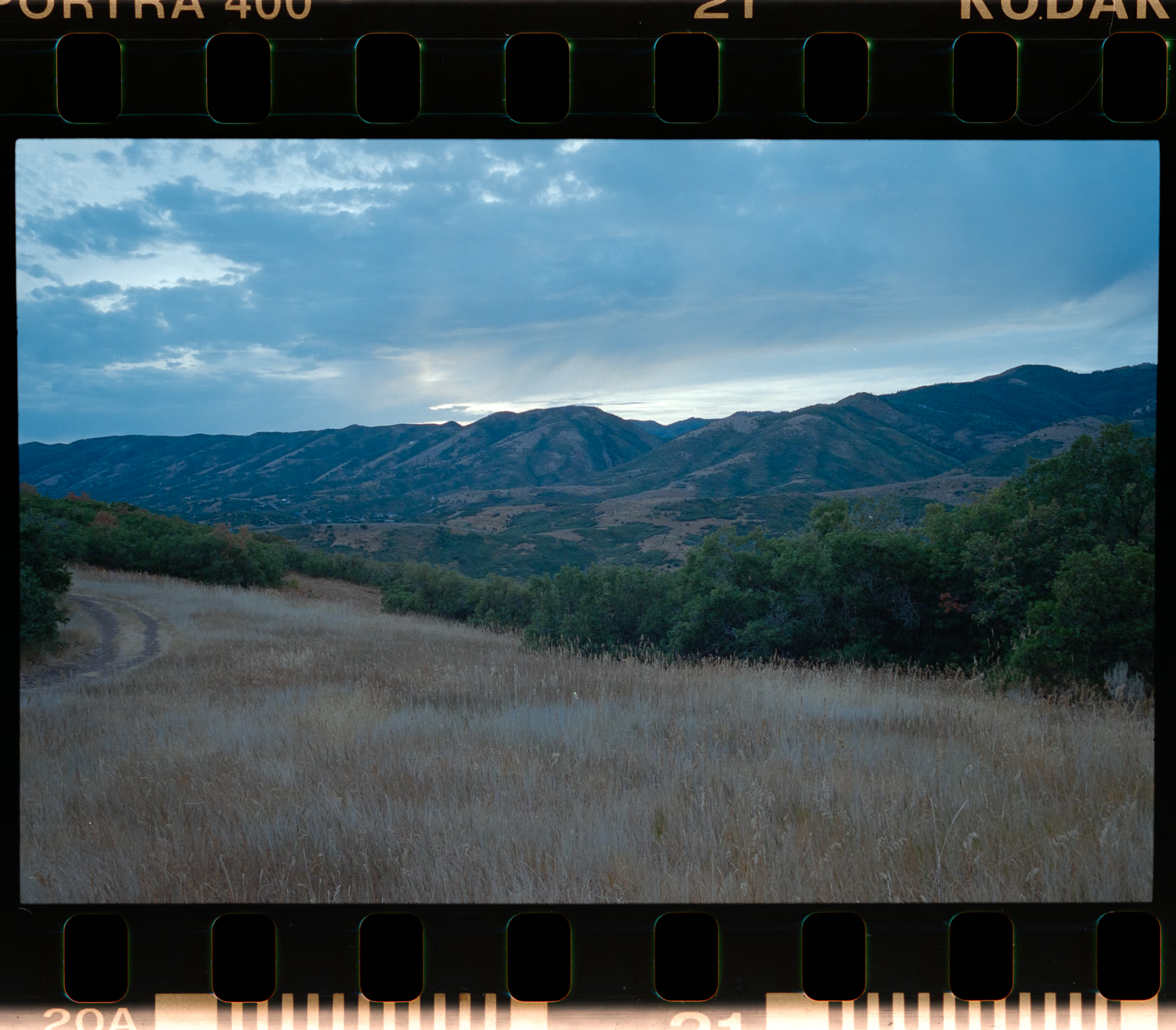
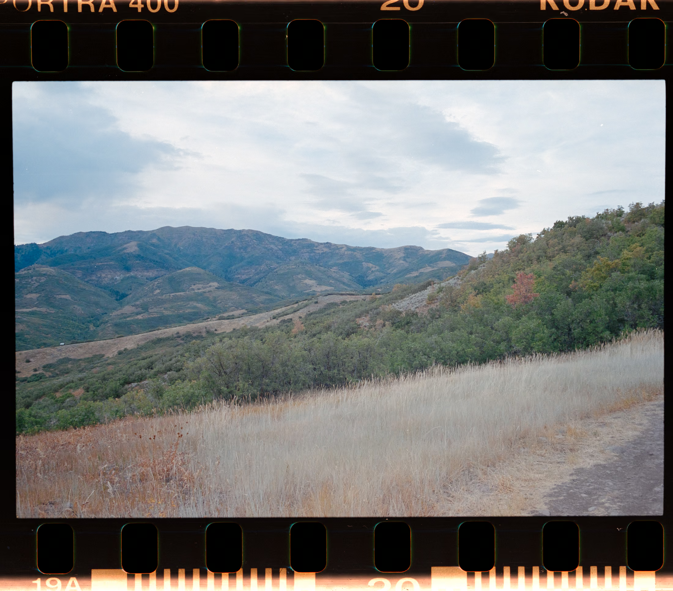
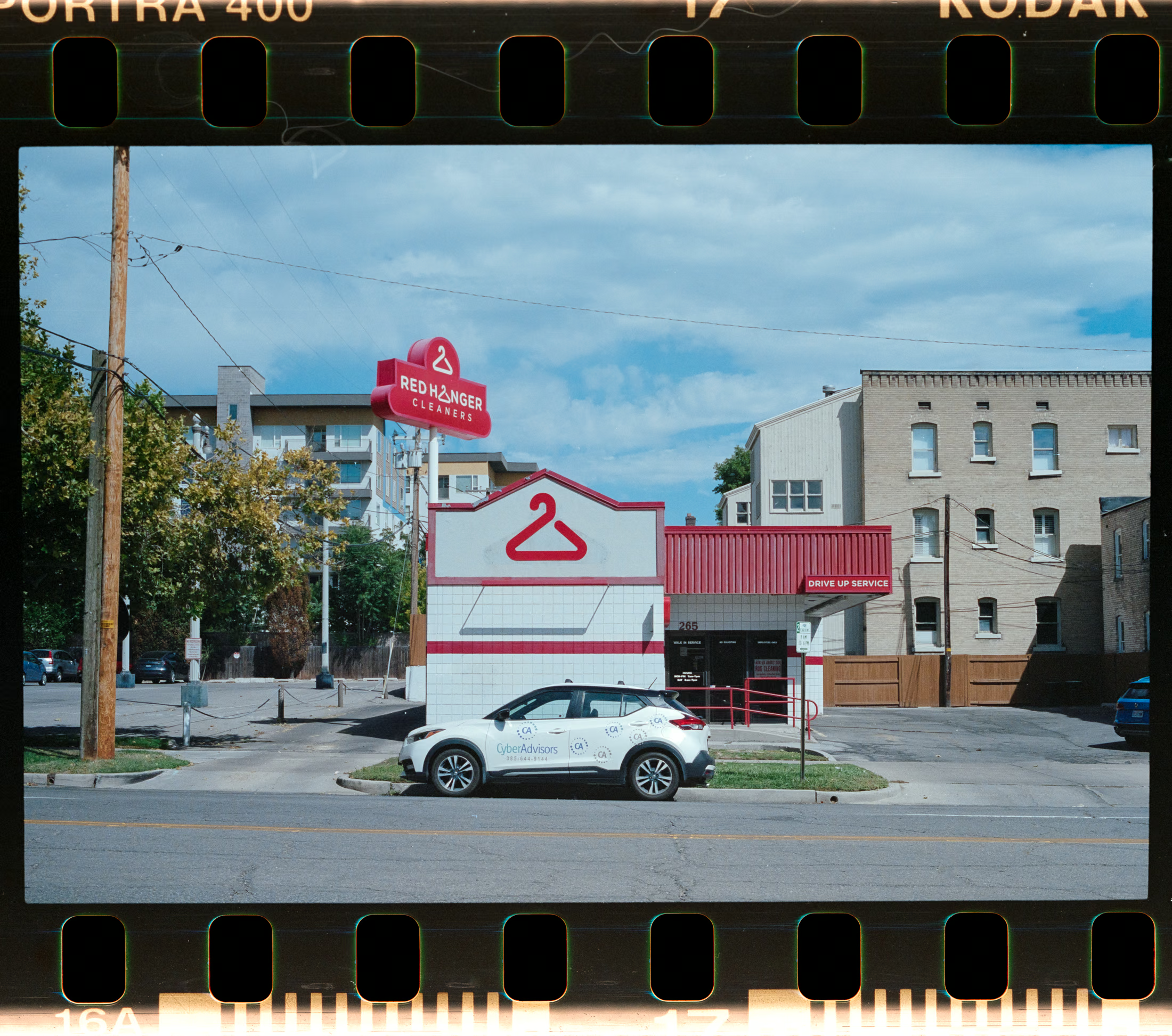
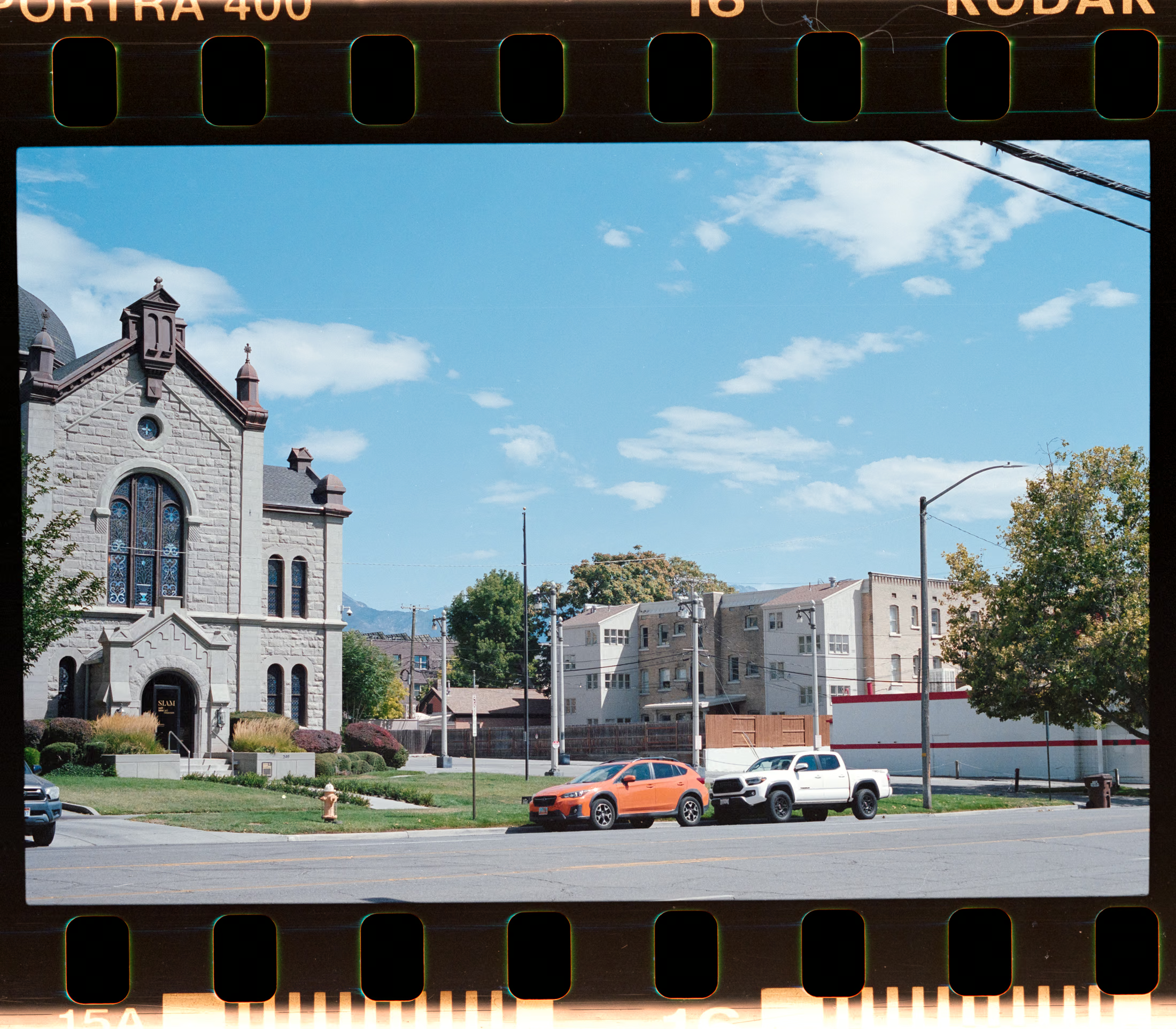
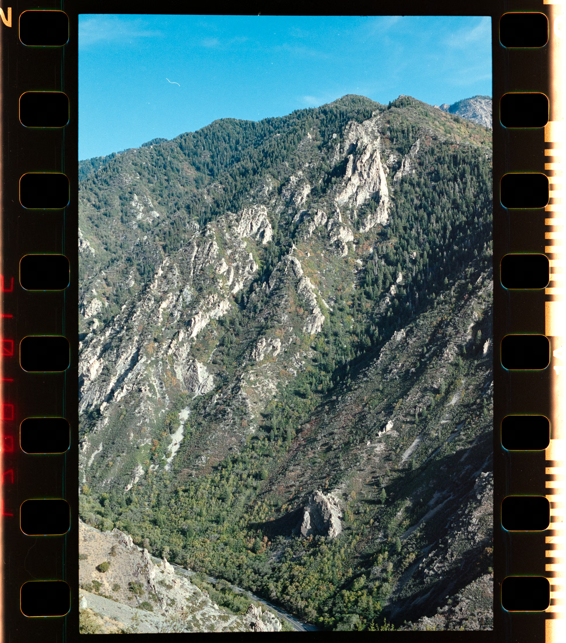
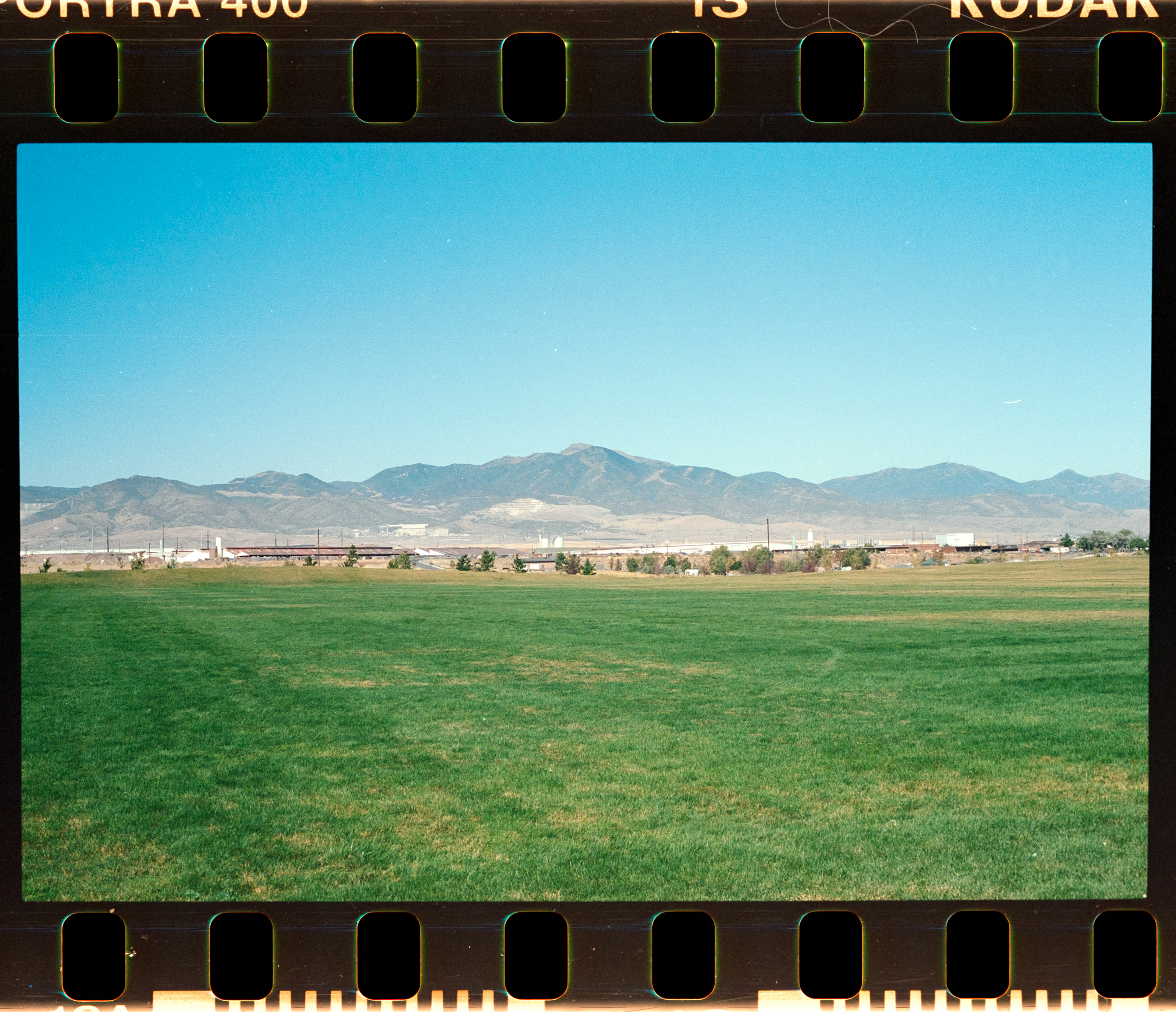
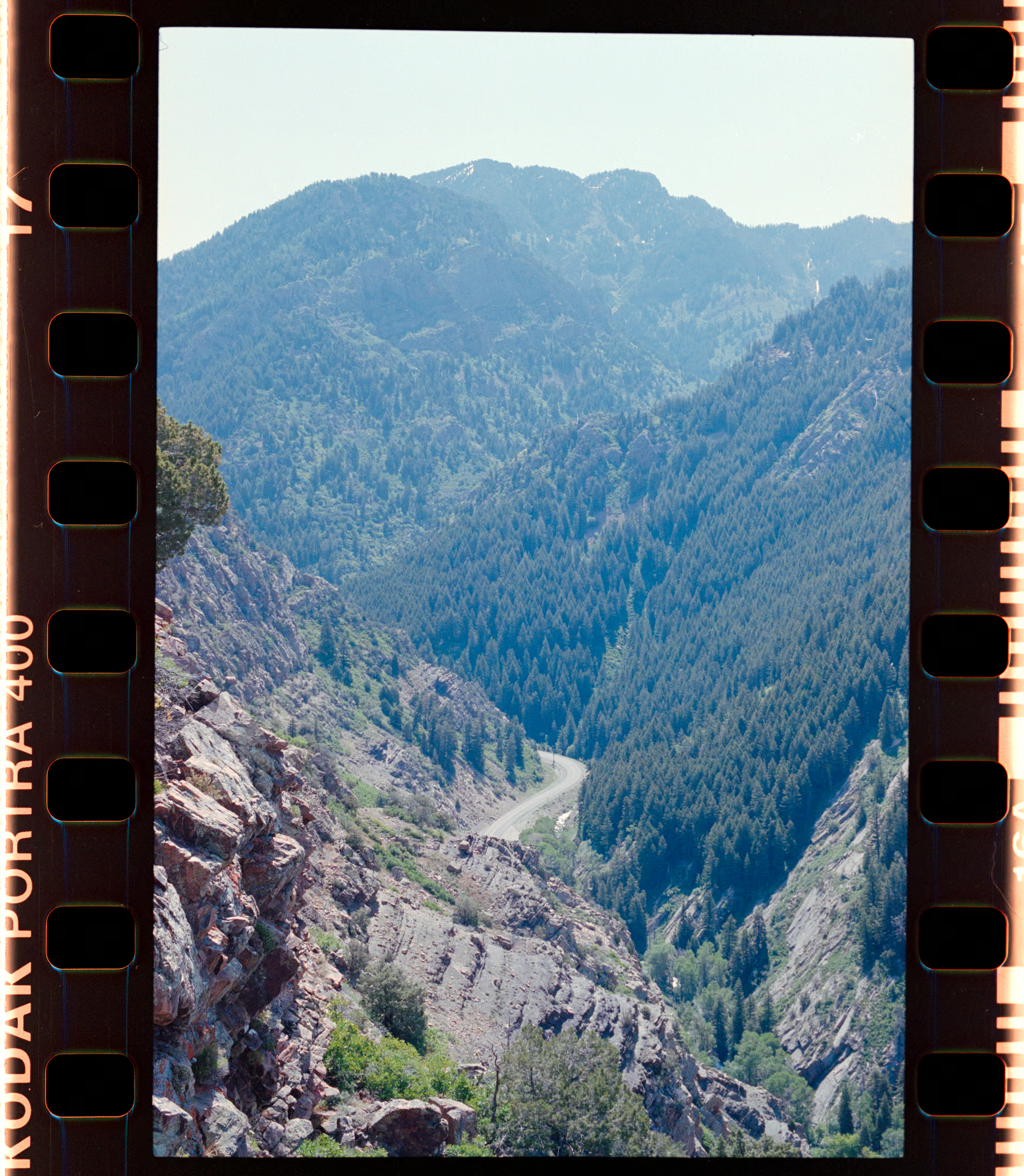
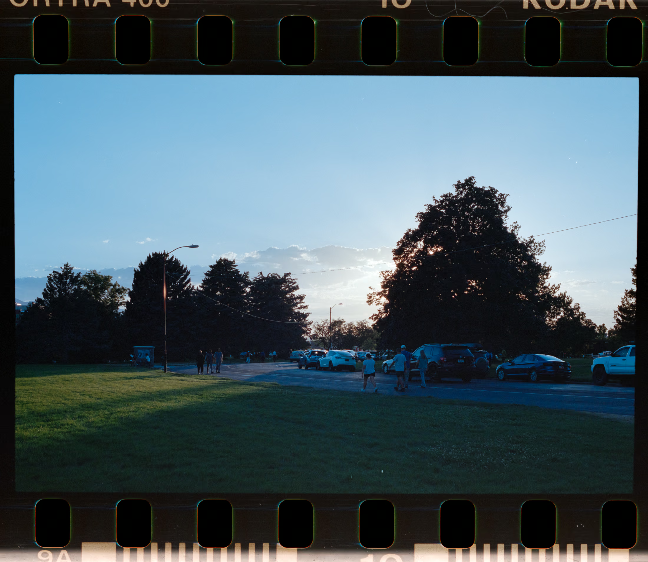
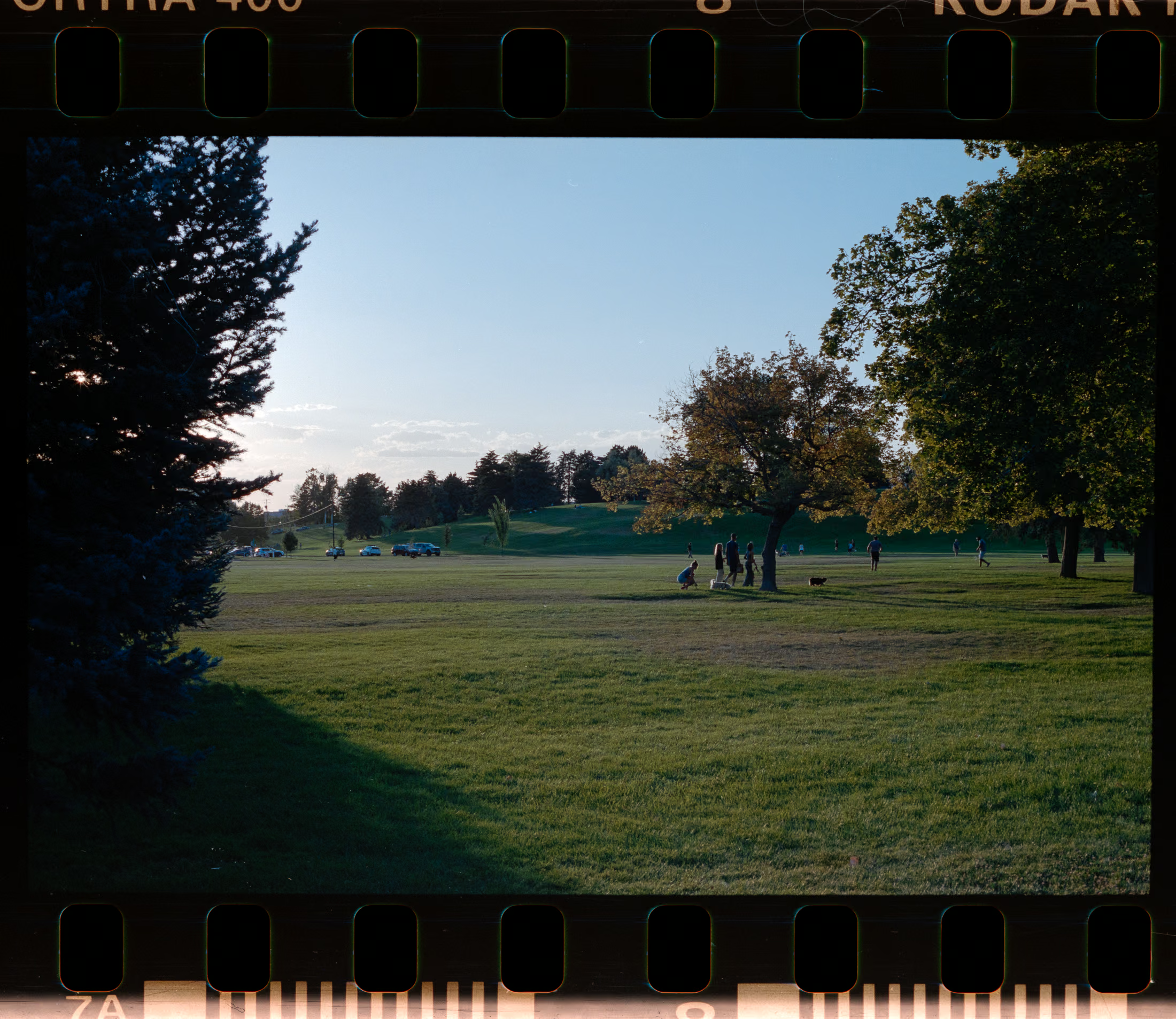
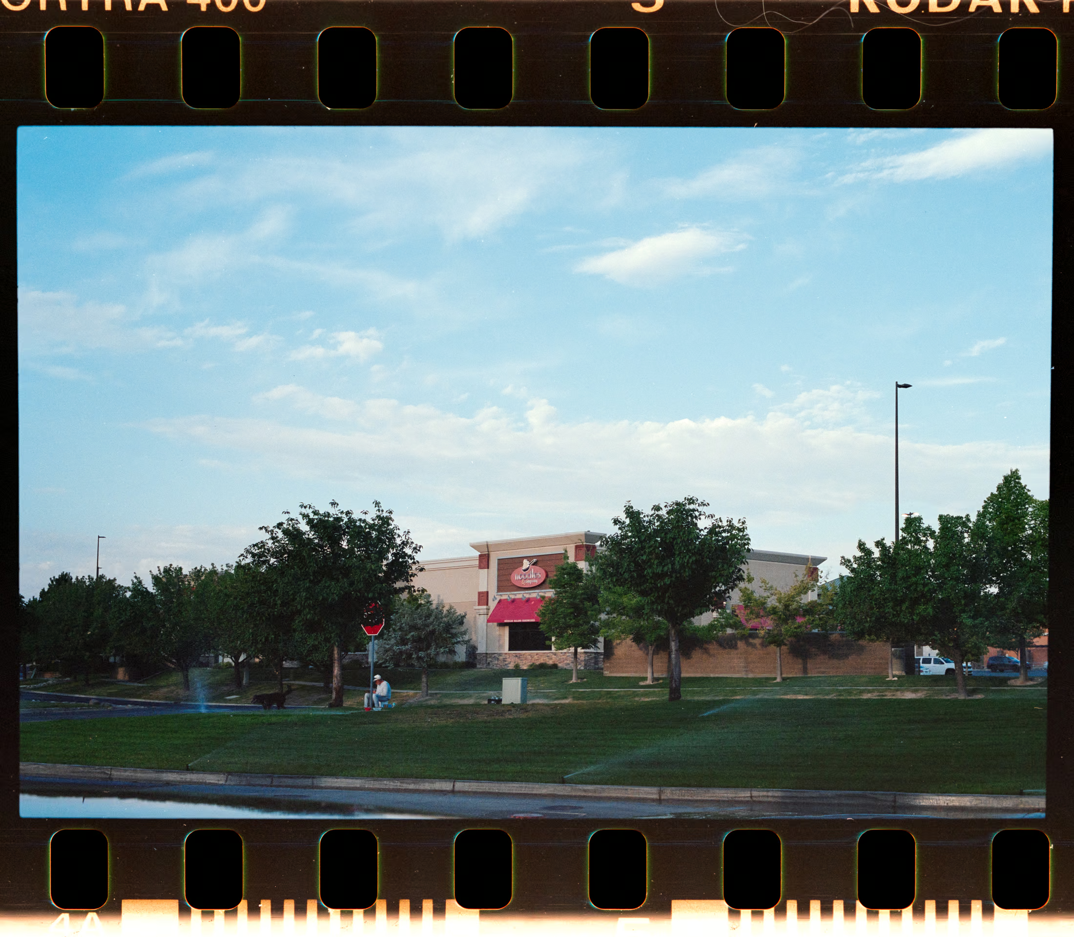
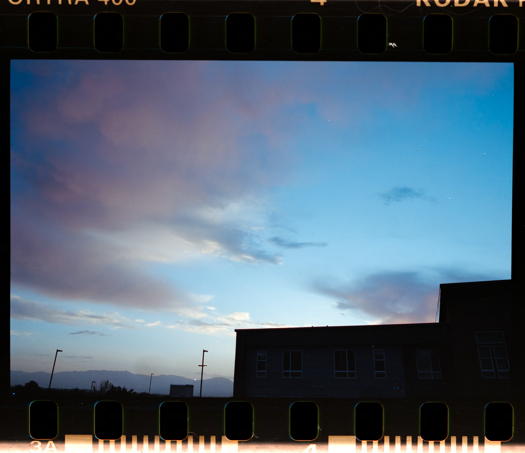
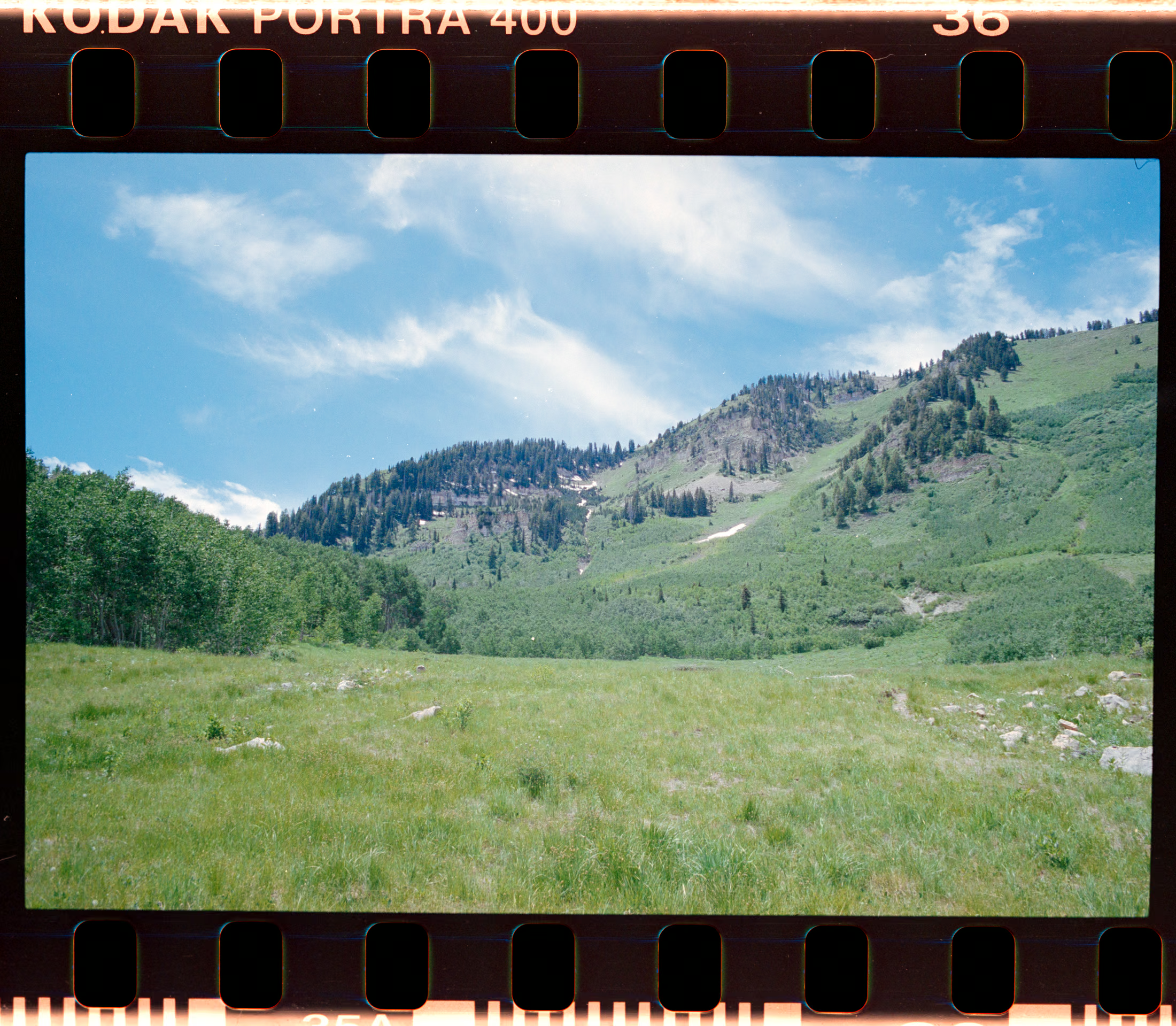
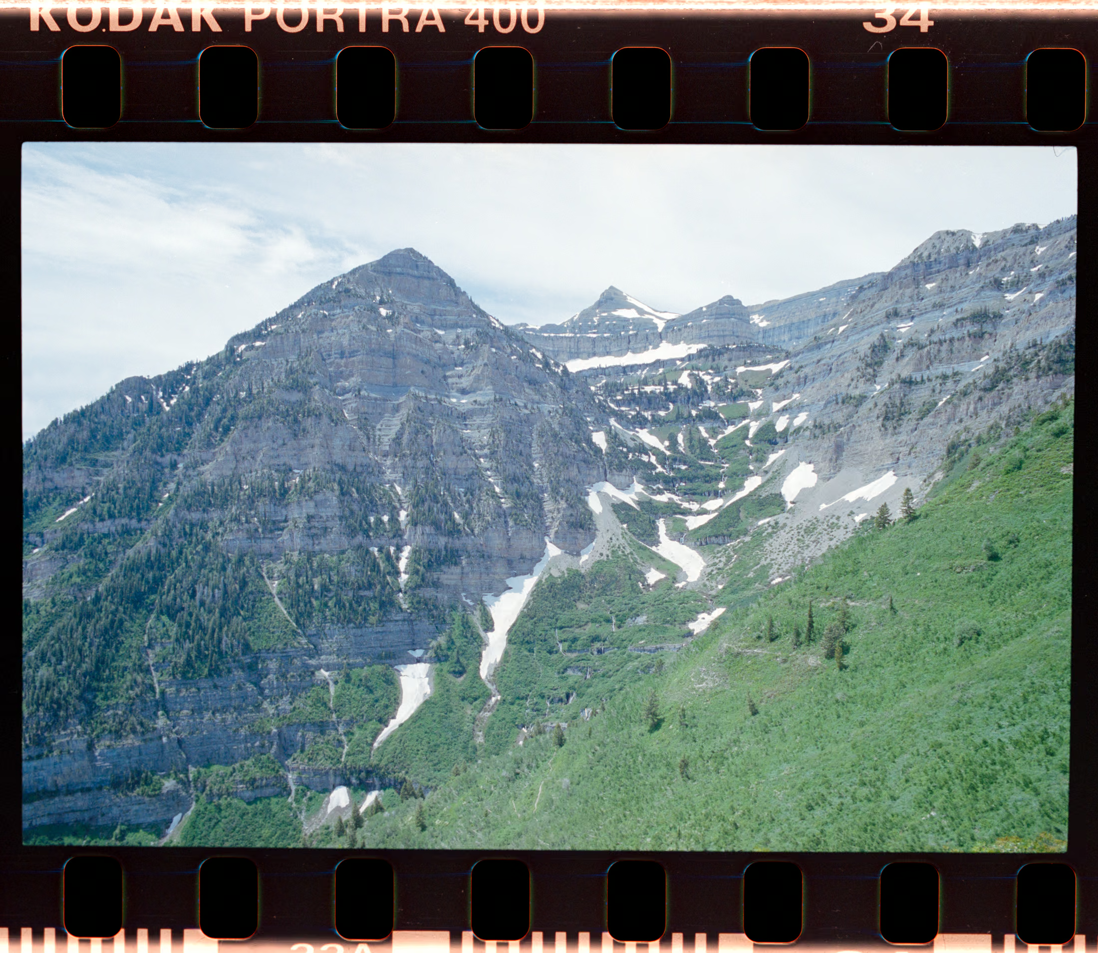
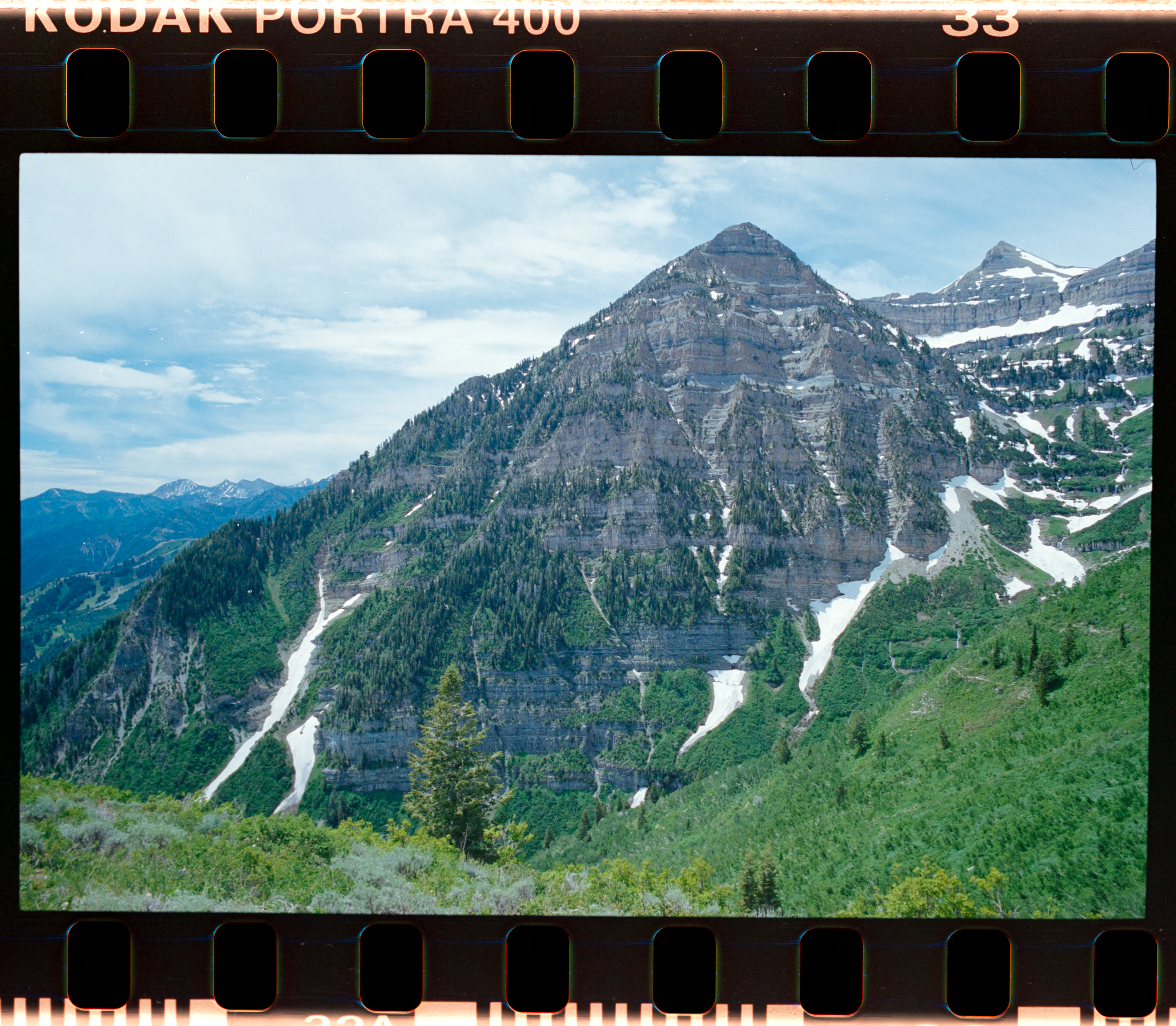
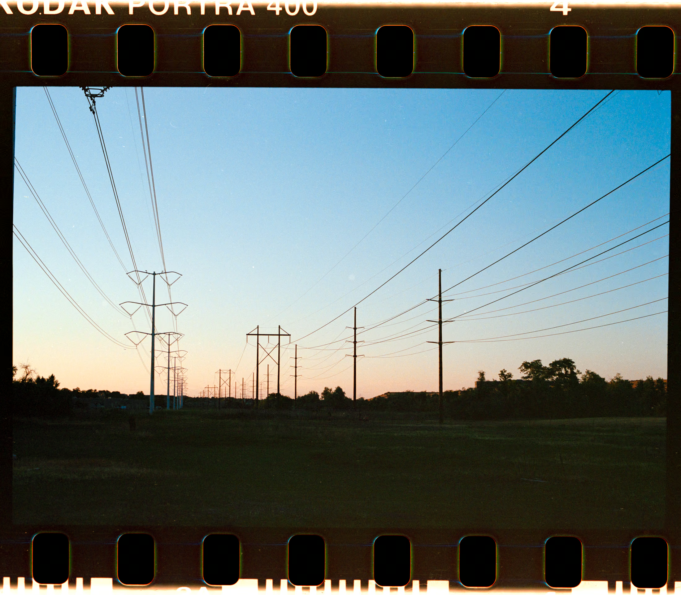
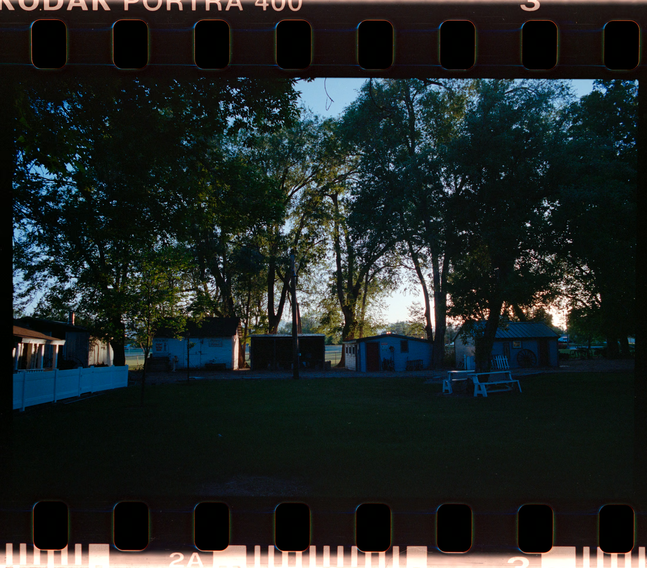
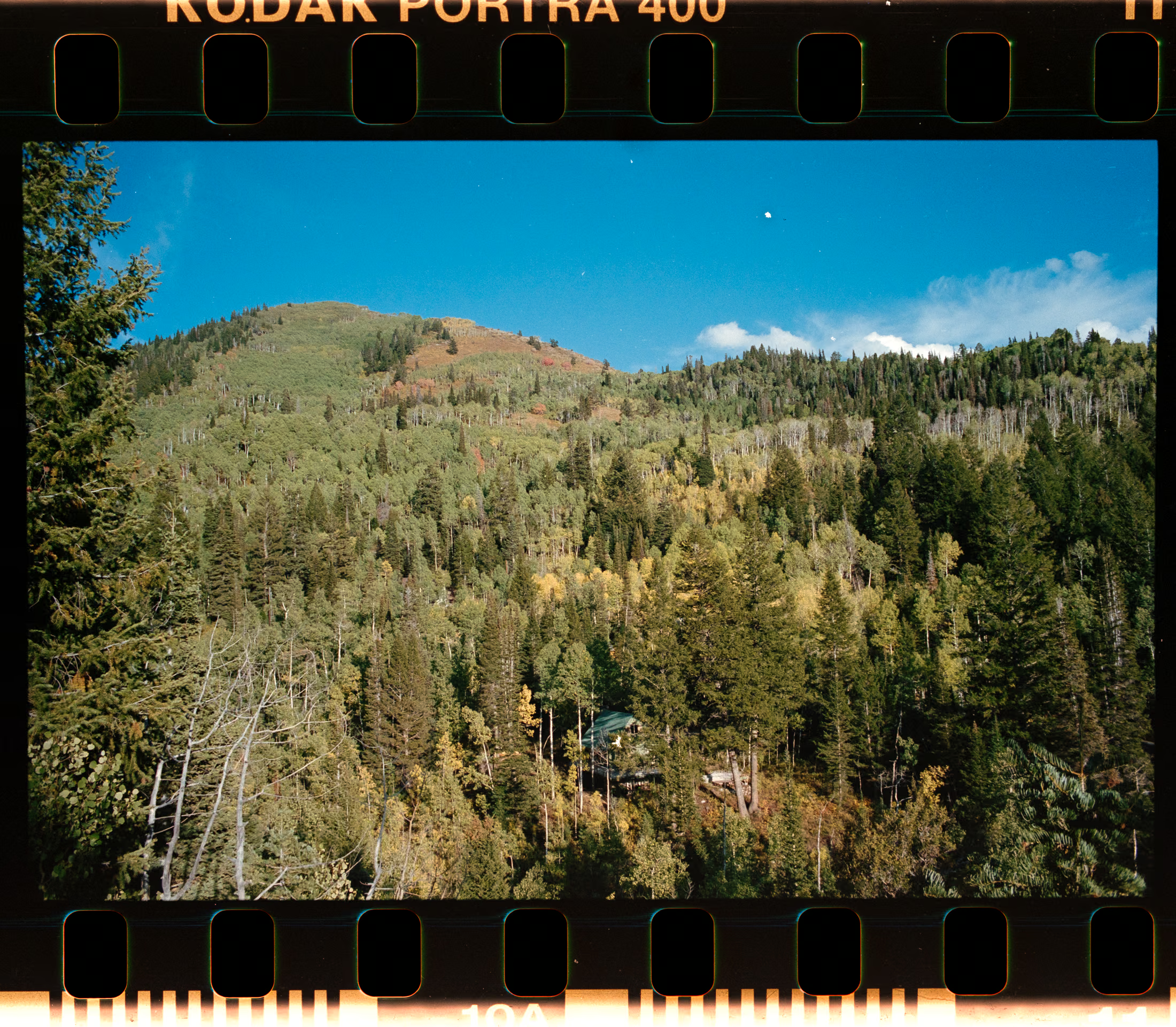
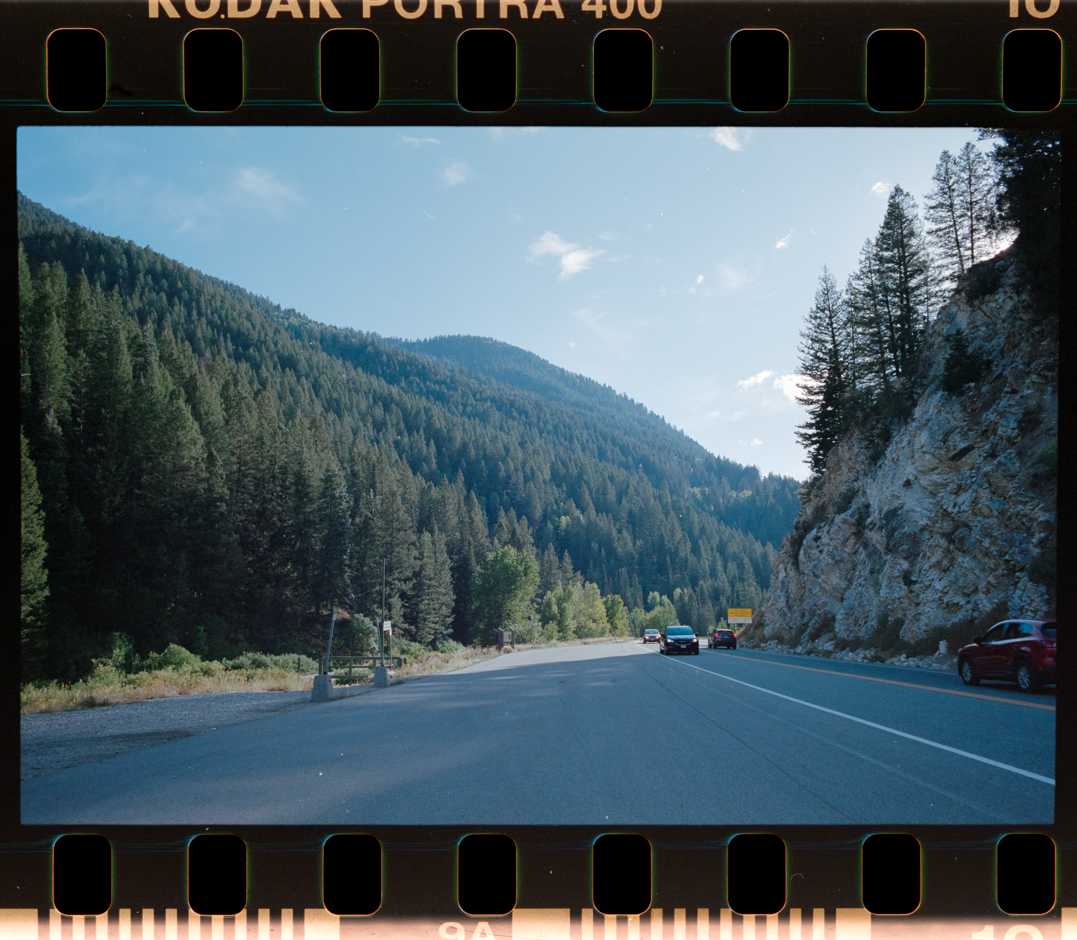
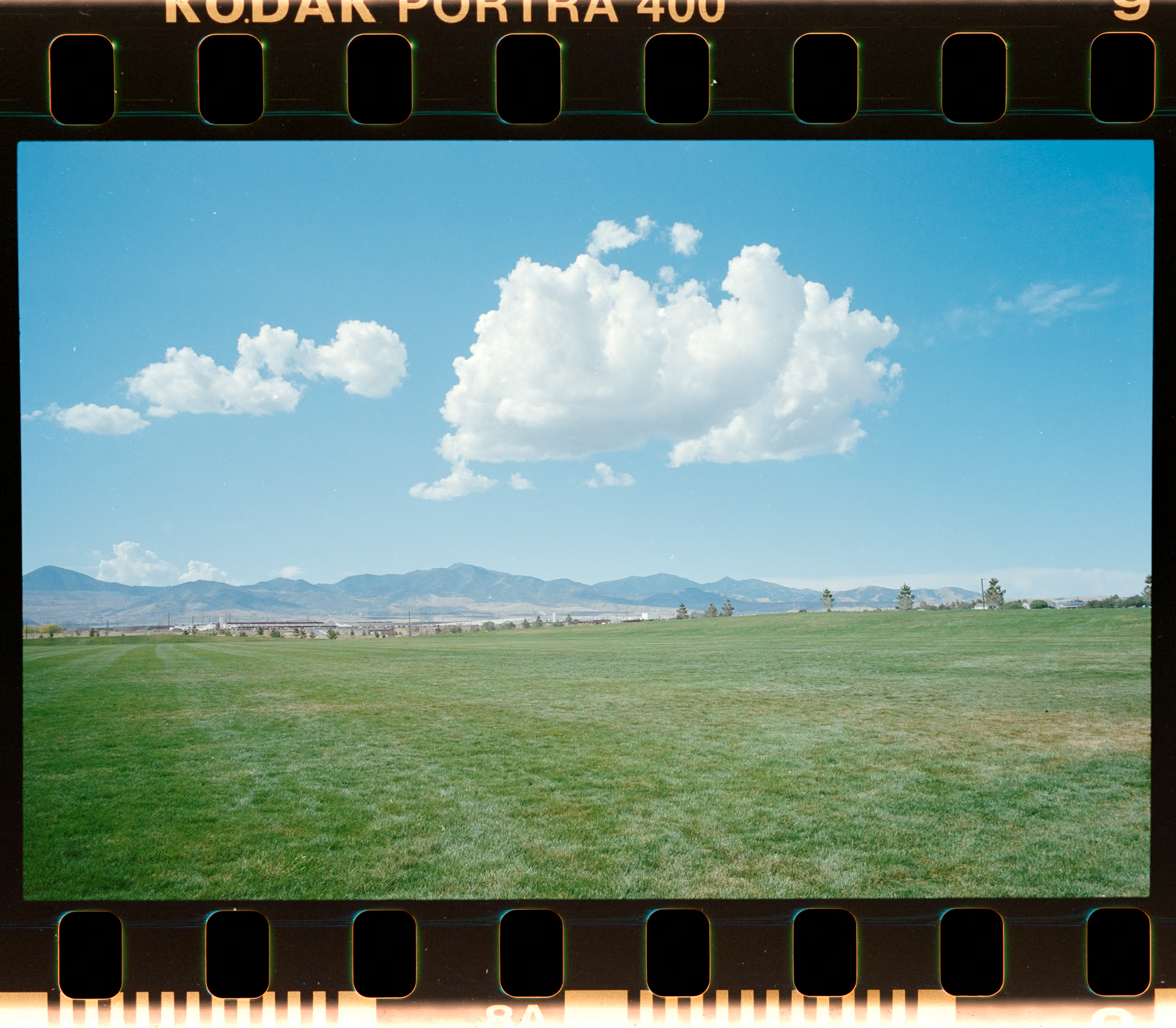
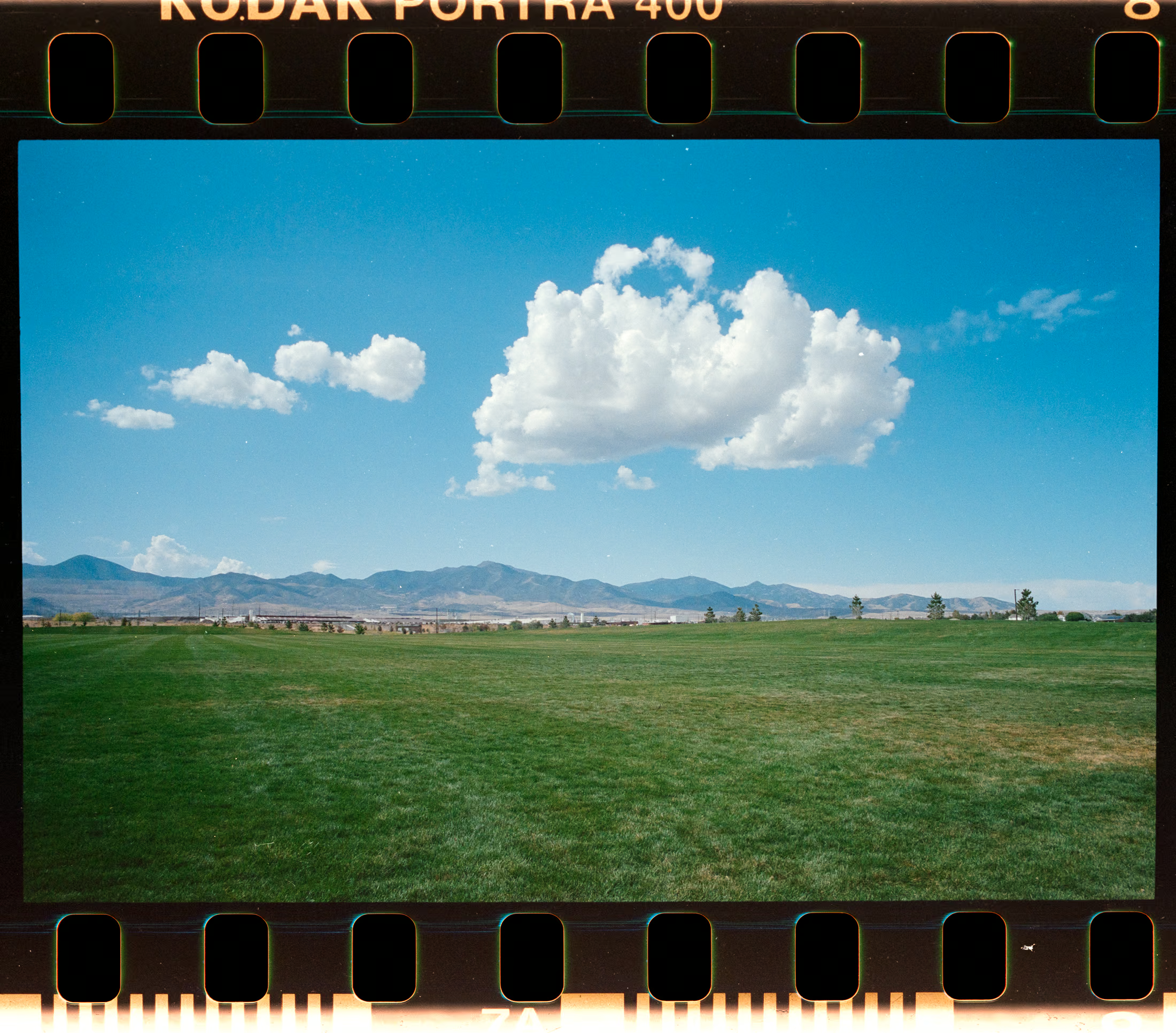
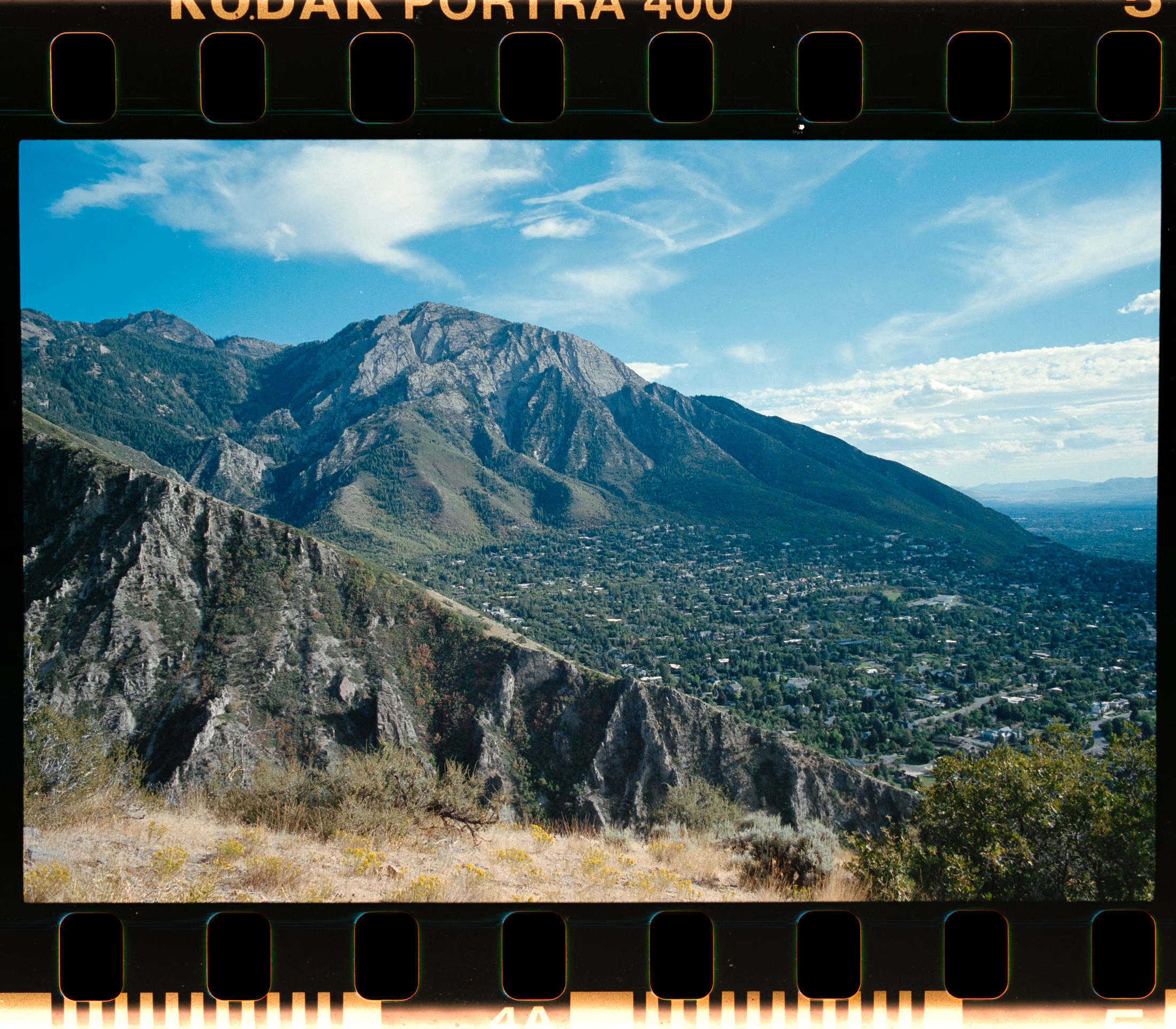
After shooting and scanning four rolls of Kodak Portra 400 over the past year and a half, my overall assessment is that the film is somewhat overrated relative to its reputation. In practical use, Portra 400 consistently renders cooler colour temperatures, exhibiting a subtle shift that suggests a partial bias toward tungsten-balanced behaviour. It’s not as pronounced as a true tungsten stock, but the cooler palette is noticeable, especially when compared to Kodak Gold. With a controlled white-balance adjustment in the scan, Portra 400 and Gold can look remarkably similar. So similar, in fact, that it becomes difficult to distinguish the two. Gold inherently provides a natural warmth that Portra lacks in its native scan. This contrasts with the common online representation of Portra 400, where many samples appear artificially warm or heavily post-processed. After proper white-balance correction, Portra 400 can produce pleasing results, but based on my scans, its performance doesn’t fully justify the level of hype it often receives.